For organizations, the value of an employee dashboard comes from consistency. When the same definitions, calculations, filters, and reporting periods are used each time, managers can compare results without rebuilding the reporting process from scratch. A template also provides a repeatable structure for collecting source data, validating it, calculating metrics, and presenting the result. That makes the reporting cycle easier to maintain as the workforce grows or reporting requirements change.
The best dashboards separate raw data from analysis and presentation. A source table should contain clean records, while calculations should be controlled in a separate layer and the dashboard should focus on the information decision-makers actually need. This principle applies whether the final product is built in Excel, Google Sheets, Power BI, or a presentation format. Microsoft describes an Excel dashboard as a visual representation of key metrics and documents the use of PivotTables, PivotCharts, slicers, and timelines for dynamic reporting. Microsoft’s Excel dashboard guidance provides a useful technical reference.
A dashboard should also answer a clear business question. For example, an operations manager may want to know how many employees are active, where staffing gaps exist, whether attendance patterns are changing, which teams require attention, and how performance measures compare with targets. A human resources team may need a broader view covering headcount, hiring, turnover, tenure, absence, training, and workforce composition. A reporting employees dashboard template should therefore be designed around decisions rather than around the number of charts that can fit on a page.
The examples and recommendations in this guide focus on practical dashboard construction, data preparation, visualization, reporting workflows, platform choices, quality control, and responsible interpretation. The numerical scenarios are illustrative rather than claims about any particular organization. A useful dashboard can be simple, but it must be trustworthy, clearly defined, easy to refresh, and appropriate for the people who will use it.

What Is a Reporting Employees Dashboard Template?
A reporting employees dashboard template is a reusable reporting framework for organizing employee-related data into a consistent visual format. It normally includes a data input area, calculated metrics, charts or tables, filters, summary indicators, and explanatory labels. The template may be adapted for a department, an entire organization, a project team, or a specific reporting period.
The word “template” is important because the dashboard is intended to be reused. A monthly employee report should not require a manager to redesign every chart each month. Instead, the source data changes while the structure, formulas, visual hierarchy, and reporting logic remain stable. Good templates therefore reduce repetitive work and make recurring reporting more predictable.
The dashboard itself is only the visible layer of the reporting system. Behind it is usually a data model containing employee identifiers, departments, locations, job categories, dates, employment status, attendance measures, performance indicators, and other fields. The model must be designed before the visual layer because poor source data will produce misleading charts regardless of how polished the dashboard looks.
A strong template also documents definitions. If one manager interprets “active employees” as everyone on payroll while another counts only employees currently working, the dashboard can create confusion even when the formulas are technically correct. Each metric should therefore have a clear definition, time period, unit, and source. Definitions are especially important when dashboards combine information from payroll, HR systems, spreadsheets, surveys, and operational databases.
Finally, a dashboard template should make exceptions visible. A sudden change in headcount, an unusual absence pattern, or a department falling below a target may deserve investigation rather than an automatic conclusion. The dashboard should help users identify questions for further review. It should not encourage people to treat a single metric as a complete explanation of employee behavior or organizational performance.
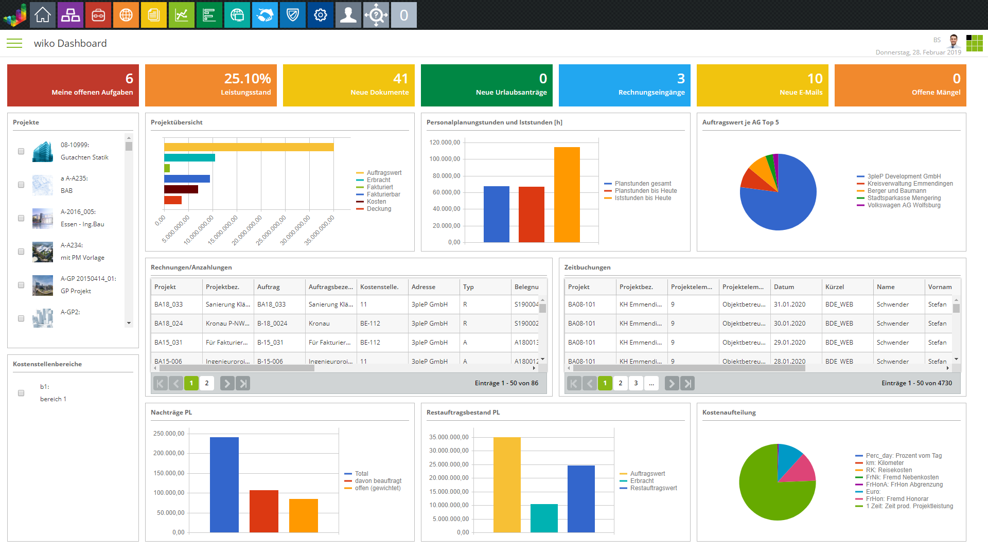
Why Employee Reporting Dashboards Matter
Traditional employee reporting often involves several disconnected documents. One spreadsheet may contain headcount, another may contain attendance, another may contain performance information, and a presentation may summarize selected figures for executives. This approach can work at a small scale, but it becomes difficult to maintain when the number of employees, departments, or reporting periods increases.
A dashboard provides a common visual reference. Instead of asking users to search across multiple tabs, it can place the most important indicators near the top and provide supporting charts underneath. This allows users to move from a high-level question to a more detailed question without losing the overall context.
Dashboards are also useful for recurring management meetings. A consistent monthly or weekly view makes it easier to identify changes from one period to another. If the dashboard includes comparison fields such as previous period, target, budget, or benchmark, managers can focus their conversation on differences that require explanation.
Another benefit is reporting efficiency. Once the data preparation process has been standardized, the same dashboard can often be refreshed rather than recreated. In Excel, Microsoft documents the use of PivotTables and PivotCharts together with slicers and timelines for dynamic dashboard filtering. These features illustrate the broader principle that reporting should separate data refresh from presentation work.
Power BI follows a similar principle but is designed for interactive reporting at a different level of scale. Microsoft explains that Power BI dashboards are single-page canvases that highlight important visualizations, while reports can contain multiple pages and support richer filtering and exploration. Understanding this distinction helps organizations decide whether they need a compact monitoring dashboard, a detailed analytical report, or both.

Core Components of an Employee Dashboard
The first component is a reliable employee data table. Typical fields might include an employee identifier, department, job family, location, employment type, start date, status, reporting manager, and selected reporting measures. The exact fields depend on the reporting purpose. Avoid collecting fields simply because they might be interesting; unnecessary personal data increases maintenance requirements and may create privacy concerns.
The second component is a KPI layer. Common examples include total active headcount, new hires during the period, exits, average tenure, absence days, training completion, open positions, and performance measures. A KPI is useful when its meaning and calculation are stable. A dashboard with twenty loosely defined indicators is often less useful than one with six clearly defined measures.
The third component is a time dimension. Employee reporting frequently depends on dates, so the dashboard should distinguish between point-in-time measures and period measures. Headcount on a specific date is different from the number of employees who worked during a month. New hires during a quarter are different from the current number of employees with less than three months of tenure.
The fourth component is segmentation. Managers may need to filter results by department, location, job category, employment type, manager, or reporting period. Segmentation should be designed around legitimate management questions. Excessive filtering can make a dashboard difficult to use, while insufficient filtering can hide meaningful differences between groups.
The fifth component is visualization. Charts should explain patterns that are difficult to see in a raw table. A bar chart may compare departments, a line chart may show change over time, a stacked chart may show workforce composition, and a table may provide exact values for follow-up. Google Sheets documentation similarly distinguishes chart types by analytical purpose, including line charts for trends, bar or column charts for comparisons, scatter charts for relationships, and table charts for dashboard-style data presentation.

Choosing the Right Employee Metrics
Headcount is usually a starting point, but it should not be the entire dashboard. A useful headcount measure identifies the population being counted and the date on which it is measured. If contractors, temporary workers, interns, and permanent employees are combined without explanation, the resulting number may not answer the management question.
Hiring metrics provide another useful perspective. A recruitment dashboard might track open roles, applications received, candidates progressing through stages, accepted offers, and average time between recruitment milestones. These measures can be useful for operational planning, but they should not be interpreted as a complete assessment of recruitment quality without considering role difficulty, hiring conditions, and business context.
Turnover measures require particular care. An employee exit count is straightforward, but a turnover rate depends on a denominator and a defined period. A template should clearly state the formula used. Different organizations may calculate turnover differently, so copying a formula from another dashboard without checking the definition can create misleading comparisons.
Attendance and absence measures should likewise distinguish between different types of absence and different measurement methods. A simple count of absence events may tell a different story from total absence days. A rate based on scheduled working time can provide another perspective. The dashboard should make the selected measure obvious rather than leaving users to infer what a number represents.
Performance indicators should be treated as context-sensitive measures. A target achievement percentage may be useful for a sales team, while project completion or service-level measures may be more relevant for another function. Employee dashboards work best when metrics reflect the actual operating model of the organization rather than using a generic collection of HR numbers.

How to Analyze Trends in Employee Reports
Trend analysis compares a measure across multiple reporting periods. For example, a monthly headcount series can reveal whether staffing is increasing, decreasing, or remaining relatively stable. A trend is more informative when the dashboard provides enough historical context to distinguish a genuine change from a temporary fluctuation.
When interpreting a trend, first check whether the underlying population changed. A department may show a lower absence rate because its workforce composition changed, because seasonal employees were removed from the dataset, or because the reporting period was incomplete. The chart alone cannot explain the reason for the change.
Second, review the data refresh and reporting dates. A dashboard that combines current headcount with older attendance records may create apparent relationships that are not meaningful. Every major visualization should have a clear reporting period and, where appropriate, a visible last-refresh indicator.
Third, compare trends with targets or historical baselines carefully. A target is not the same as an average. If the dashboard displays a target line, users should know who established it and what period or operating assumption it represents. A historical average can be useful as context but should not automatically be treated as a desirable outcome.
Finally, avoid overreacting to one unusual point. A single month may contain holidays, seasonal work, reorganizations, hiring campaigns, or other events that make it atypical. A strong employee reporting dashboard helps users see the broader pattern before making a conclusion.

Using Comparisons Without Misleading the Reader
Comparisons are among the most useful dashboard functions. A manager may want to compare departments, regions, job categories, or reporting periods. The comparison becomes meaningful only when the categories are measured consistently. If one department reports complete data and another reports only selected records, a visual ranking can be misleading.
Use common scales when comparing similar charts. If one department chart uses a vertical axis from zero to one hundred and another uses a narrower range, visual differences may appear larger or smaller than they really are. Consistent scales improve interpretation and reduce the risk of exaggerating small differences.
Percentages should be accompanied by counts when the population sizes differ substantially. A small department may have a high percentage because a single event affected a small denominator, while a large department may have a lower percentage despite having a larger absolute number of events.
Rankings also deserve caution. A department appearing at the bottom of a performance chart does not automatically indicate poor management or low employee quality. It may reflect role complexity, staffing mix, workload, measurement differences, or data completeness. A dashboard should identify where investigation is needed rather than turning a descriptive metric into a judgment.
When comparisons are presented to executives, the dashboard should make the comparison basis visible. Labels such as “current month,” “previous month,” “year to date,” and “target” are more useful than unexplained abbreviations. The reader should be able to understand what is being compared without opening the source workbook.

Choosing Charts for Employee Data
Bar charts are usually effective for comparing departments or categories. If a dashboard shows headcount by department, a horizontal bar chart can make category names easier to read. Sorting the categories can also help users identify the largest or smallest values quickly.
Line charts are useful when the primary question concerns movement over time. They work well for monthly headcount, hiring activity, absence rates, or training completion trends. Too many lines on one chart, however, can create visual noise. When several measures are required, consider separate charts or a carefully selected filter.
Stacked charts can show composition. For example, employee counts might be separated into employment types or job groups. The viewer can then see both the total and the composition, although too many categories make stacked charts difficult to interpret.
Tables remain important even in highly visual dashboards. Managers sometimes need the exact value behind a chart, especially when preparing a decision, checking a discrepancy, or communicating with another team. A compact table can serve as a bridge between visual analysis and operational follow-up.
Specialized charts such as box plots can help analysts examine distributions, medians, quartiles, and potential outliers. They are generally more suitable for analytical audiences than for executive summaries. The principle is simple: select the chart according to the question, not according to which chart style looks most impressive.

Distribution, Outliers, and Employee Reporting
Average values can hide important differences within a workforce. Suppose an illustrative department has employees with very different training hours. An average may look normal even though some employees received substantially more training and others received almost none. Distribution-focused analysis can reveal this variation.
Outliers should be investigated rather than automatically removed. An unusually high absence value could represent a legitimate extended leave, a data-entry error, or a special situation. Deleting the value without investigation may make the dashboard look cleaner while making the analysis less accurate.
Quartiles and medians can be useful when employee measures are unevenly distributed. For example, compensation, tenure, or time-to-completion measures may contain a few high values that pull an arithmetic average upward. A dashboard aimed at analytical users can present both average and median where the distinction matters.
Distribution charts should also respect privacy. Small groups can sometimes make individual employees identifiable, especially when several attributes are combined. Employee dashboards should use appropriate aggregation and access controls rather than exposing unnecessary personal information.
The reporting template should provide enough context for an analyst to investigate anomalies. Useful supporting fields may include reporting period, department, employee category, data source, and record status. The dashboard does not need to display all these fields at once, but they should be available in the underlying reporting structure.

Relationships and Deeper Analysis
Scatter plots can help analysts explore relationships between two numeric measures. In an employee reporting context, an organization might examine whether training hours and a selected operational measure move together. Such a chart can suggest questions, but it does not prove that one variable causes another.
Correlation should therefore be treated as an analytical signal rather than a conclusion. Employees with more training may also belong to departments with different workloads, managers, or job requirements. Several variables can influence the same outcome, which means additional analysis may be necessary.
When a relationship appears important, segment the data carefully. A pattern visible across the whole organization may disappear when departments are examined separately. Conversely, a relationship that looks weak overall may become clearer within a particular job family.
Employee dashboards are particularly vulnerable to overinterpretation because people naturally attach explanations to workforce numbers. A chart can show that two measures changed together, but qualitative context, business process knowledge, and appropriate statistical analysis may be needed before explaining why.
For recurring reporting, the template should distinguish descriptive reporting from deeper analysis. The dashboard can provide the signal, while a supporting analytical workbook or report can provide detailed investigation. Keeping those layers separate prevents the main dashboard from becoming overloaded.

Building the Source Data in Excel
Excel remains practical for many employee reporting projects because it combines tabular data management, formulas, PivotTables, charts, filters, and presentation tools in one application. It is especially useful when the source data is moderate in size and the reporting process is controlled by a small team.
Start with a structured source table. Each row should represent a consistent unit, such as an employee-period record or an employee event, and each column should represent one field. Avoid merged cells, decorative headings, blank rows inside the dataset, and multiple unrelated tables occupying the same range.
Use stable identifiers rather than relying on employee names as the primary key. Names can change or be duplicated, while an internal identifier can provide a more consistent reference. The identifier should be protected appropriately because employee-related datasets can contain sensitive information.
Keep raw data separate from formulas and dashboard objects. This makes troubleshooting easier and reduces the risk that a user accidentally overwrites source records. A common structure is a raw-data sheet, a cleaned-data or calculation sheet, a pivot or summary layer, and a dashboard sheet.
Microsoft’s Excel documentation describes PivotTables as tools for analyzing data and notes that slicers can provide quick filtering. Timelines can also filter PivotTables by periods such as years, quarters, months, or days. These capabilities make Excel suitable for a reusable reporting employees dashboard template when the data model is well organized.

Formatting and Standardizing Spreadsheet Reports
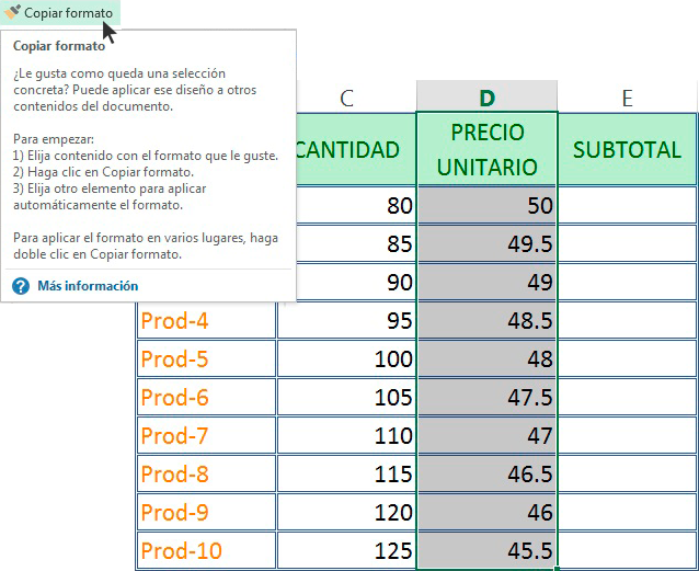
Formatting should support interpretation rather than compete with it. Use consistent number formats for counts, percentages, dates, and currency. A percentage should look like a percentage, and a date should follow one predictable convention throughout the workbook.
Conditional formatting can help users identify exceptions, but it should be applied selectively. If every cell has a different color, the dashboard becomes difficult to scan. A simple rule highlighting values outside a defined target range can be more effective than a large collection of decorative colors.
Labels should be written for the audience. “Voluntary turnover rate” is more informative than “VTR” unless the abbreviation is universally understood within the organization. Dashboard titles should identify both the measure and reporting period when that context is important.
Freeze panes and sensible column widths can improve usability in supporting worksheets. Users should not need to scroll horizontally through dozens of fields just to identify the employee ID or reporting date. The raw data layer can be detailed, but it should remain operationally manageable.
Before publishing a workbook, test formulas with known examples. Create a small controlled dataset in which the expected results can be calculated manually. If the dashboard produces the expected result for the test data, confidence in the logic increases. This is a simple but powerful quality-control step.
Using Google Sheets for Collaborative Reporting
Google Sheets can be attractive when several authorized users need to collaborate on a reporting workbook. Its browser-based workflow makes it convenient for teams that already use Google Workspace, especially when the reporting process involves shared data entry, comments, and collaborative review.
Google Sheets supports PivotTables for narrowing large datasets and examining relationships between data points. Its documentation also explains that PivotTables can be refreshed when source cells change. This makes the tool suitable for lightweight reporting systems when the data volume and governance requirements are appropriate.
Slicers can be useful for dashboard-style reporting in Google Sheets. Google’s documentation states that slicers can filter tables, charts, or PivotTables in a custom dashboard. A well-designed employee dashboard can therefore provide filters such as department, employment type, location, or reporting period without requiring users to edit formulas manually.
Collaboration should not mean that everyone can change everything. Protect important formulas and reporting logic, define who owns the source data, and establish a controlled process for adding or correcting records. Shared spreadsheets become unreliable when users make undocumented structural changes.
For organizations using external data systems, integration options should also be evaluated. Google Sheets can work with connected data in appropriate environments, but a reporting workflow should be designed around refresh reliability, permissions, data volume, and auditability rather than simply choosing the easiest connection.
Designing an Executive Reporting Dashboard
Executive dashboards should answer the most important questions quickly. The first screen should not contain every available employee metric. Instead, it should provide a concise summary of workforce size, major movements, important risks, and selected performance indicators.
A useful hierarchy starts with high-level KPIs, followed by trend charts, comparisons, and supporting detail. Users should be able to understand the overall state of the workforce before exploring individual categories.
Use visual emphasis carefully. A large number should be reserved for an important measure, while secondary measures can use smaller cards or table values. The dashboard should guide attention without making every item appear equally urgent.
Annotations can be valuable when an unusual result has a known explanation. For example, an illustrative dashboard might note that headcount changed because a new business unit was added to the reporting population. Without that context, readers may interpret the movement incorrectly.
Executive reporting also benefits from a clear refresh date. A dashboard is not automatically useful simply because it is visually polished. Users need to know whether the information is current enough for the decision they are making.

Dashboard Reporting Template Examples by Use Case
A headcount dashboard can focus on active employees, new hires, exits, workforce composition, and historical movement. It is useful for staffing reviews and workforce planning, particularly when managers need to see both current totals and changes over time.
An attendance dashboard can focus on scheduled days, absence days, absence rates, attendance patterns, and departmental comparisons. Because absence information can be sensitive, access should be limited to authorized users and aggregation should be considered when groups are small.
A recruitment dashboard can track open positions, candidates at each stage, offers, accepted hires, and recruitment cycle measures. The dashboard should distinguish current pipeline information from completed hiring outcomes so users do not confuse active candidates with confirmed hires.
A performance dashboard can summarize approved performance measures, target achievement, project completion, service levels, or other role-specific indicators. It should avoid presenting subjective judgments as objective facts and should document how each performance measure is calculated.
A training dashboard can show employees assigned to training, completion rates, overdue items, training hours, and selected course categories. The useful design depends on whether the primary audience needs compliance monitoring, capability planning, or learning-program analysis.

Power BI for More Interactive Employee Reporting
Power BI is useful when employee reporting needs richer interactivity, multiple report pages, data modeling, or connections to several sources. Microsoft describes Power BI reports as interactive, multi-page documents and distinguishes them from dashboards, which are single-page canvases focused on important visualizations.
A Power BI employee reporting solution can separate the semantic model from the report design. This makes it possible to reuse definitions and calculations across multiple report pages. A workforce overview page might show high-level KPIs, while separate pages could focus on hiring, turnover, attendance, or workforce composition.
Filters and slicers can help users move from organization-level information to a specific department or period. However, too many slicers can make a report difficult to understand. Each filter should exist because users genuinely need that dimension to answer a recurring question.
Power BI also makes drill-through and detailed exploration possible in reports. This can be valuable when a manager starts with a high-level metric and then needs to investigate the categories contributing to it. The detailed layer should still respect access permissions and privacy rules.
For a reporting employees dashboard template power bi implementation, the most important preparation step is the data model. A visually attractive Power BI report cannot compensate for inconsistent employee identifiers, unclear date logic, duplicate records, or poorly defined measures. Model quality should come before visual polish.

Online Dashboards and Remote Reporting
An online dashboard can be useful when authorized users need access from different locations. Browser-based reporting reduces dependence on manually distributed files and can provide a shared view of the current reporting state.
Online reporting requires stronger attention to access control. Employee information should not be published publicly simply because a dashboard is easy to share. Permissions should follow the sensitivity of the data and the responsibilities of the people viewing it.
Refresh behavior should also be documented. Users need to know whether the dashboard updates continuously, on a schedule, or only when someone manually refreshes the source. A dashboard that looks live but contains yesterday’s data can create false confidence.
Mobile and smaller-screen use should be considered when the audience frequently reviews dashboards away from a desktop. Important KPIs should remain readable, filters should be understandable, and detailed tables should not dominate the primary view.
Online dashboards are most effective when they complement an established reporting process. They should not become an uncontrolled replacement for source systems, employee records, or formal documentation. The dashboard is an interpretation layer that helps users understand authorized data.

PowerPoint and Presentation-Based Reporting
PowerPoint can be useful when employee dashboard information must be presented in a meeting, board pack, management review, or formal presentation. It is especially helpful when the audience needs a narrative rather than an interactive analytical environment.
A presentation should not simply copy an entire spreadsheet dashboard onto a slide. The slide should focus on the decisions or discussion points relevant to the audience. A small set of KPIs, one or two meaningful charts, and a concise explanation can be more effective than a crowded dashboard screenshot.
When PowerPoint is used as the reporting destination, establish a consistent slide structure. For example, the top section can show current indicators, the middle section can show trends, and the bottom section can show notable changes or management actions.
Be careful with screenshots. A screenshot can become outdated immediately after the source dashboard is refreshed. If a presentation is expected to remain accurate for a longer period, include the reporting date and clearly distinguish the snapshot from live data.
A reporting employees dashboard template powerpoint or reporting employees dashboard template ppt is therefore best viewed as a presentation framework rather than a replacement for the underlying reporting model. The source data and calculations should remain controlled elsewhere whenever possible.

Data Quality Checks Before Publishing
Data validation should begin before charts are created. Check whether employee identifiers are unique, required fields are populated, dates are valid, department names use consistent spelling, and employment-status values follow a controlled list.
Duplicate records can seriously distort dashboard results. If one employee appears twice in a headcount calculation, the total may be inflated. Duplicate event records can similarly distort attendance, training, recruitment, or performance measures.
Missing data should be treated explicitly. A blank cell does not necessarily mean zero. It may mean unknown, not applicable, not reported, or not yet available. The reporting model should distinguish those meanings whenever the distinction affects interpretation.
Period boundaries should be tested. Monthly reporting can be distorted if dates are stored as text, time zones are inconsistent, or transactions are assigned to the wrong reporting period. Create test cases around the first and last days of a period to identify boundary errors.
Finally, reconcile dashboard totals with an independent source. If the dashboard says there are 487 active employees, compare that figure with the authoritative employee system or a controlled reconciliation report. Reconciliation is one of the most important controls in recurring employee reporting.

Common Mistakes in Employee Dashboards
The first mistake is trying to show everything. A dashboard should not become a warehouse for every available employee field. Excessive information makes important patterns harder to see and increases maintenance requirements.
The second mistake is using undefined KPIs. Labels such as “productivity,” “performance,” or “engagement” can represent very different calculations. Each should have a documented definition and, where relevant, a clear denominator and reporting period.
The third mistake is mixing incompatible populations. For example, a current headcount measure should not automatically be compared with a historical event measure unless the population and period are compatible. Always check whether the numerator and denominator represent the same conceptual population.
The fourth mistake is relying on decorative visualizations. Gauges, excessive colors, 3D charts, and complex graphics may make a dashboard appear sophisticated while reducing clarity. A simple chart that answers a real question is usually more valuable than a visually complex chart that does not.
The fifth mistake is failing to document ownership. Someone should be responsible for the source data, metric definitions, dashboard maintenance, access permissions, and refresh schedule. Without ownership, even a technically excellent template can become unreliable over time.
Practical Solution: How to Build a Reporting Employees Dashboard Template
Start by writing down the decisions the dashboard is supposed to support. Limit the first version to a small number of recurring questions, such as current workforce size, recent workforce movement, staffing needs, attendance patterns, or performance against approved targets. This prevents the project from becoming a collection of unrelated charts.
Next, create a source-data dictionary. List every field, its definition, acceptable values, data type, source system, and owner. Include definitions for employee status, reporting dates, departments, job categories, and each KPI. A dictionary reduces disagreements later because the reporting team has a shared reference.
Then build a clean source table. Standardize identifiers, dates, categories, and status values before creating calculations. Keep raw records separate from calculated fields and dashboard objects. If data comes from several systems, establish a consistent employee identifier and documented rules for resolving differences.
Build the calculations next and test them independently. For each KPI, create at least one manually verified example. Check totals against an authoritative source and test edge cases such as zero employees, missing dates, duplicate identifiers, and partial reporting periods.
Only after the calculations are stable should you design the dashboard. Place the most important KPIs first, followed by trends and comparisons. Add filters only when they support a genuine recurring question. Keep the number of visuals manageable and make every chart title explain what the viewer is seeing.
Finally, define the operating process. Specify who refreshes the data, how often it is refreshed, who reviews anomalies, who can access the dashboard, and where the approved version is stored. A template becomes genuinely useful when the organization can operate it consistently without depending on the person who originally built it.
Reference Examples
The following visual references illustrate the types of spreadsheet, dashboard, reporting, presentation, and analytical layouts that can inform a reporting employees dashboard template. They are visual examples rather than claims that the pictured files are employee-specific downloadable templates.
reporting employees dashboard template excel
Source: Wikimedia Commons.
reporting employees dashboard template google sheets

Source: Wikimedia Commons.
reporting employees dashboard template power bi

Source: Wikimedia Commons.
reporting employees dashboard template free

Source: Wikimedia Commons.
reporting employees dashboard template free download

Source: Wikimedia Commons.
reporting employees dashboard template excel free

Source: Wikimedia Commons.
reporting employees dashboard template powerpoint

Source: Wikimedia Commons.
reporting employees dashboard template ppt
.jpg)
Source: Wikimedia Commons.
dashboard reporting template examples

Source: Wikimedia Commons.
reporting and dashboard templates

Source: Wikimedia Commons.
dashboard reporting template online

Source: Wikimedia Commons.
dashboard reporting template free

Source: Wikimedia Commons.
Frequently Asked Questions
What should a reporting employees dashboard template include?
At minimum, it should include a controlled source-data structure, clearly defined KPIs, reporting dates, useful filters, appropriate charts or tables, data-quality checks, and a documented refresh process. The exact measures depend on the organization’s reporting objectives.
Is Excel suitable for employee dashboard reporting?
Yes. Excel can be effective for small and medium-sized reporting workflows, particularly when the source data is structured and the process uses PivotTables, PivotCharts, slicers, timelines, formulas, and controlled refresh procedures. Larger or more complex environments may benefit from a dedicated business-intelligence platform.
Can Google Sheets be used for employee dashboards?
Yes. Google Sheets supports PivotTables, charts, slicers, formulas, and collaborative editing. It can work well for lightweight reporting and collaborative workflows, provided that access, data quality, ownership, and privacy are managed appropriately.
What is the difference between a dashboard and a report?
A dashboard generally emphasizes a concise view of important indicators, while a report can provide multiple pages, detailed tables, filtering, and deeper analysis. In Power BI, Microsoft explicitly distinguishes single-page dashboards from multi-page reports, making the distinction especially important when designing an interactive reporting solution.
Should employee dashboards show individual employee names?
Not necessarily. Many management questions can be answered with aggregated information by department, location, role, or reporting period. Individual-level information should be shown only when there is a legitimate business need and appropriate authorization.
How often should an employee dashboard be updated?
The appropriate frequency depends on the decision being supported. A workforce-planning dashboard may be updated weekly or monthly, while operational reporting may require more frequent refreshes. The important point is to define a refresh schedule and display the reporting or refresh date clearly.
What makes a dashboard template easy to maintain?
Separation of raw data, calculations, and presentation is one of the strongest design practices. Consistent field names, documented formulas, controlled categories, named tables or measures, and clear ownership also make maintenance easier.
How can I make a dashboard useful for executives?
Prioritize a small set of decision-relevant KPIs, show meaningful changes over time, highlight exceptions, provide concise comparisons, and avoid unnecessary detail on the first screen. Detailed supporting information can remain available in secondary pages or worksheets.
Conclusion
A reporting employees dashboard template is most valuable when it turns recurring employee information into a consistent decision-support process. The template should begin with clean, well-defined data and end with a visual report that answers specific management questions. Excel, Google Sheets, Power BI, and presentation tools can all play a role, but the platform matters less than the quality of the underlying reporting model.
Successful employee dashboards use clearly defined metrics, appropriate comparisons, meaningful time periods, carefully selected charts, and transparent refresh processes. They also recognize the limitations of workforce data. A number can identify a pattern without explaining its cause, and a comparison can identify a difference without proving that one group is performing better or worse for a particular reason.
The practical workflow is straightforward: define the questions, document the metrics, prepare the source data, validate the calculations, design the visual hierarchy, test the dashboard, establish ownership, and review the results regularly. A reusable template should make that process easier each time rather than becoming another document that requires manual reconstruction.
When privacy, access control, data quality, and metric definitions are treated as part of dashboard design rather than as afterthoughts, employee reporting becomes more dependable. Managers can spend less time reconciling spreadsheets and more time understanding changes, investigating exceptions, and planning appropriate actions.
The strongest reporting employees dashboard template is therefore not the one with the most charts or the most sophisticated appearance. It is the one that provides trustworthy information, makes important patterns easy to recognize, supports the decisions its audience actually makes, and can be refreshed and maintained consistently over time.

Used thoughtfully, a reporting employees dashboard template can become a dependable bridge between employee data and management action: structured enough for repeatable reporting, flexible enough for changing business needs, and clear enough to help readers move from a number on the screen to a well-informed question or decision.
