A medical doctor roll up banner Template is more than a tall promotional graphic placed beside a reception desk or exhibition booth. It is a compact communication system that has to identify a medical practice, establish trust, explain services, and give visitors an obvious next step within only a few seconds. Because viewers usually encounter a roll-up banner while standing or walking past it, the design must work at a distance before its smaller details become useful up close.
The strongest designs combine a clear hierarchy with restrained medical imagery, readable typography, consistent branding, and carefully selected information. A banner may introduce a physician, promote a health screening, explain clinic specialties, advertise an event, or direct visitors toward registration. The purpose determines the message, while the template provides the visual framework that keeps the message organized.
This article explains how to plan the structure, select a suitable format, prepare content, choose colors and imagery, handle contact information, work with common editing formats, and prepare artwork for production. It also examines practical examples so you can judge whether a medical banner is merely attractive or actually useful in a healthcare setting.

What a medical doctor roll up banner Template should accomplish
The first job of a medical banner is recognition. A visitor should understand what organization or physician it represents without having to read every line. The clinic name, doctor name, specialty, logo, and main message therefore deserve a prominent position. If the banner is being used at an event, the viewer should also be able to understand its purpose from the headline rather than from a dense paragraph of supporting copy.
The second job is prioritization. A vertical banner gives you plenty of physical height but very little horizontal width, so every element competes for attention. A practical hierarchy normally begins with the brand or physician identity, continues with one dominant message, then presents selected services or benefits, and ends with contact information. Trying to give every service equal visual emphasis usually weakens the entire design.
The third job is action. A good banner should answer the question, “What should the viewer do next?” That action might be to scan a QR code, visit a reception desk, call a clinic, remember a specialist’s name, attend a health campaign, or ask about a particular service. The call to action should be concise and placed where it remains visible without competing with the main message.

Choose the right content structure before designing
Before opening a design editor, write the banner content as a simple outline. A physician-focused version may contain the doctor’s name, specialty, clinic name, short positioning statement, three or four services, appointment information, and contact details. A hospital version may instead emphasize departments, diagnostic services, emergency information, or a health campaign. The outline prevents design decisions from driving the content backward.
A useful content structure is a vertical sequence of five zones. The top zone identifies the brand or doctor. The next zone presents the main visual and headline. The center explains selected services or advantages. The lower section provides a clear action. The footer contains contact details, location, website, or a QR code. These zones can overlap visually, but the reading order should remain obvious.
Keep the message focused enough that a person can understand the main point while standing several steps away. A banner that tries to explain an entire clinic is likely to become crowded. Instead, use the roll-up display as an entry point into the broader brand. A short statement can create interest, while the website, QR code, or reception team supplies the deeper information.

Use one dominant headline
The headline should express one idea rather than several competing claims. “Specialist Cardiology Consultation,” “Family Health Screening,” or “Advanced Diagnostic Services” is more useful than a vague collection of promotional phrases. If the physician’s personal reputation is the central subject, the doctor’s name and specialty can become the headline while the clinic name acts as supporting identity.
Supporting copy should explain rather than repeat the headline. For example, if the main message is about preventive health screening, the supporting text can briefly describe who the service is intended for and what visitors can expect. It should not simply restate “professional,” “quality,” or “trusted” several times without adding information.
Visual hierarchy is especially important because viewers do not read banners like articles. They scan. A strong headline, a recognizable image, a small number of service points, and a clear contact area create a path through the design. Decorative elements should reinforce that path rather than interrupt it.

Design the upper section for immediate recognition
The upper portion of a roll-up banner is usually the first area encountered by the eye, so it should contain the information that must survive a quick glance. This can include the clinic logo, doctor name, specialty, campaign identity, or a short positioning line. Avoid filling the upper area with small contact details that will only be useful once someone has already decided to approach.
A physician portrait can be effective when personal recognition is central to the communication. However, the portrait should have enough surrounding space to remain visually distinct. A tightly cropped face, a busy background, or a photograph with poor contrast can compete with the headline and make the entire banner feel crowded.
When photography is not necessary, medical symbols, abstract shapes, equipment details, anatomical illustrations, or clean geometric forms can establish the healthcare theme without relying on a portrait. This approach can also make the banner more reusable when the same display will represent a department, campaign, or institution rather than an individual clinician.

Build a service section that remains easy to scan
Service lists work particularly well on medical roll-up displays when each item has a short name, a simple icon, and one concise explanation. Three or four services are often easier to understand visually than a long catalog. If the clinic provides many specialties, select only the services that matter to the event, campaign, audience, or current promotion.
Icons should support recognition rather than become decoration. A heart symbol can suggest cardiac care, a laboratory symbol can identify testing, and a telephone or location symbol can support contact information. Consistent icon style matters because mixing unrelated illustration styles can make the banner look assembled from several different sources.
Descriptions should use plain language and avoid unnecessary technical terminology. If a medical term is essential, pair it with a short explanation that a general visitor can understand. The objective is not to turn the banner into a clinical document; it is to make the relevant service recognizable and encourage the viewer to seek additional information.

Use color to establish a healthcare identity
Blue, teal, green, white, and restrained neutral tones are common choices for healthcare communication because they can create a clean and organized visual impression. The important principle is not to copy a particular color combination but to establish a small palette that provides enough contrast between background, text, headings, icons, and action elements.
Color should also reflect the brand rather than become a generic medical signal. A pediatric clinic may use a brighter palette, while a specialist practice may prefer restrained navy and white. A campaign about a specific condition may have its own established visual identity. The template should accommodate these differences without losing structural consistency.
Use accent colors sparingly. If every heading, icon, border, photograph, and button uses a different bright color, the banner loses hierarchy. One dominant color, one accent color, and a neutral background can often create a more controlled result. Always evaluate text contrast at the intended viewing distance instead of judging it only on a large monitor.

Typography and readability matter more than decoration
Typography should be chosen for quick recognition. A strong sans-serif family can provide clear headlines and compact service labels, while a secondary typeface can create limited contrast. Decorative scripts may work for a short accent phrase, but they should not be responsible for essential medical information, appointment instructions, or contact details.
Use different sizes and weights to establish a hierarchy instead of relying on many typefaces. The doctor or clinic name can be prominent, the main headline slightly larger or heavier, service labels clearly separated, and supporting text smaller but still readable. Consistent spacing between lines and sections is just as important as font selection.
Long paragraphs are rarely appropriate on a roll-up banner. If a message needs several sentences to explain itself, consider moving the detailed explanation to a brochure, webpage, handout, or linked resource. The banner should communicate the essential idea quickly and make the next source of information easy to find.

Plan the bottom section carefully
The bottom of a retractable banner has a practical design challenge: part of the artwork may be visually close to the base hardware, depending on the banner system and production setup. Important text should therefore remain comfortably above the area where the physical stand or roll mechanism may interfere. Always confirm the printer’s production specifications before finalizing the artwork.
Contact information should be prioritized according to the intended audience. A clinic may need a phone number and location. An event banner may need a QR code and registration address. A hospital campaign may need a website and department name. Including every possible channel creates clutter, so choose the contact methods that can actually be used by the people viewing the display.
QR codes should have enough clear space around them to remain scannable. Do not bury the code inside a complicated background or reduce it until it becomes difficult to recognize. Add a short instruction such as “Scan for appointments” or “Scan for clinic details” so visitors know why the code exists.

Common template formats and editing choices
People searching for a medical doctor roll up banner template pdf often want a layout that can be reviewed or sent to a print provider without changing the overall composition. PDF can be useful as a final production format when it is exported according to the printer’s specifications, but a PDF is not automatically an editable working file. The original design format should be preserved separately when future changes are expected.
A search for a medical doctor roll up banner template word usually reflects a need for straightforward text editing rather than advanced graphic production. Word can work for simple layouts, especially when the banner contains mostly text and basic shapes, but intricate image masking, vector graphics, and color management can be easier in dedicated design software.
For collaborative editing, a medical doctor roll up banner template canva may be useful when several team members need to review wording, branding, or layout. A medical doctor roll up banner template powerpoint can also be practical for teams already accustomed to presentation software. A medical doctor roll up banner template google docs may help with content coordination, although a design-focused tool is generally better for final visual production.

How to select a template without losing originality
A template should provide structure, not dictate the entire identity of a clinic. When evaluating options, look first at the layout: Is there enough room for your actual headline? Can the logo fit without becoming tiny? Is there a logical location for services? Does the contact area accommodate your real information? If the answer to these questions is no, changing colors alone will not solve the underlying problem.
A roll up banner design template free may look attractive in a preview but still be unsuitable for professional production if its dimensions, image quality, or text hierarchy do not fit the intended display. Examine the underlying structure rather than choosing only by color. A simple template with good spacing is often more adaptable than a visually complex design with many fixed elements.
When considering a hospital banner design template, also evaluate whether the design can accommodate institutional branding. Hospitals often have multiple departments, campaigns, and communication standards, so a reusable grid, consistent logo placement, and restrained color system can be more valuable than a highly decorative composition.

Preparing artwork for production
Before you print roll up banner artwork, check the final dimensions against the actual hardware specification. Roll-up systems vary, and the visible graphic area is not always identical to the nominal product size. Ask the printer about bleed, safe zones, bottom allowances, color mode, file format, and any requirements for linked or embedded images.
Large-format printing also rewards high-quality source assets. A photograph that looks sharp on a phone can appear soft when enlarged substantially. Logos should preferably come from a high-resolution or vector source. Icons should remain crisp at the final size. Avoid repeatedly enlarging compressed images because artifacts can become more noticeable in print than on screen.
Perform a final content proof before sending artwork to production. Check the doctor’s name, specialty, clinic name, telephone number, address, web address, QR code, service names, dates, and punctuation. A beautiful banner with one incorrect contact detail can create a much larger practical problem than a minor visual imperfection.

Use realistic medical imagery
Photography should have a clear role. A doctor portrait can establish personal identity, while a laboratory photograph can reinforce diagnostic services. A hospital interior can communicate institutional scale, while a simple medical illustration can keep the banner visually clean. The image should support the headline rather than merely occupy a large empty area.
Image cropping is especially important in vertical layouts. Leave enough space around faces, equipment, and critical objects so the photograph remains understandable after it is placed inside a narrow banner. Circular or curved image masks can work well, but they should not cut through important visual information.
When using photographs of healthcare professionals or patients, make sure the organization has appropriate rights and permissions for the intended communication. Avoid using generic imagery that could create an inaccurate impression about who provides a particular service. Authentic clinic photography can be more distinctive when it is available and suitable.

When a minimal design is the better choice
A minimalist medical banner does not mean an empty banner. It means every element has a clear function. A large headline, generous white space, one strong image, three services, and a concise contact block can communicate more effectively than a dense collection of badges, icons, paragraphs, and decorative shapes.
Minimalism is particularly useful in reception areas, conference halls, medical exhibitions, and corridors where viewers may only have a short opportunity to look at the display. A calm background also helps the organization appear more deliberate and makes important information easier to locate.
If the design still looks empty after removing unnecessary elements, improve the visual balance rather than adding random decoration. Adjust image scale, spacing, typography, alignment, and color blocks first. These changes usually strengthen a banner without introducing additional information.

Adapt the template for different medical purposes
A physician introduction banner may emphasize expertise and appointment information, while a health campaign banner may emphasize a single educational message. A diagnostic center may need service categories and testing information. A hospital event may need dates, locations, and registration instructions. The same underlying grid can support these purposes if the content hierarchy changes with the objective.
For a physician, the doctor’s name and specialty should usually have more prominence than a long list of clinic services. For a hospital department, the department name and service category may take precedence. For a public health campaign, the campaign message may become the dominant element while institutional branding moves into a supporting position.
This flexibility is why a good template is better understood as a visual system. It provides consistent spacing, alignment, typography, color relationships, and content zones while leaving enough room for different campaigns. The more reusable the structure, the easier it becomes to maintain a consistent visual identity across multiple banners.

Connect the banner with other brand materials
A roll-up banner should not look like an isolated design if it belongs to an established medical organization. Match the logo treatment, primary colors, typography, photography style, and tone used on other patient-facing materials. Consistency helps visitors recognize that the banner belongs to the same organization even when they encounter it away from the main clinic.
A related banner health letterhead template can help maintain consistent branding across printed communication. The banner does not need to copy the letterhead literally, but shared visual elements such as logo placement, color accents, typography, and contact formatting can create a coherent identity across physical materials.
Brand consistency is especially useful when multiple banners are displayed together. Instead of designing every banner as a separate poster, establish a common grid and change only the campaign-specific headline, image, service information, and call to action. This produces a family of displays that feels coordinated without becoming repetitive.

Accessibility and patient-friendly communication
Medical communication should be understandable to a broad audience. Use sufficient contrast, avoid overly decorative typography, and make essential information visually distinct. Do not depend on color alone to communicate meaning because some viewers may have difficulty distinguishing particular color combinations.
Language should also be respectful and precise. Avoid exaggerated promises about treatment outcomes or language that could be interpreted as guaranteeing a medical result. A banner is a marketing and information tool, not a substitute for individualized medical advice, so its wording should accurately describe services without making unsupported clinical claims.
Consider the physical environment as well. A banner placed beside a busy reception area competes with signs, doors, screens, and other visual information. A restrained layout with one dominant message can therefore be more accessible than a dense design, even when both technically contain the same information.

Practical Solution
Start by writing a one-sentence purpose statement for the banner. For example, “Introduce Dr. Amina as a cardiology specialist and encourage visitors to request an appointment.” Then identify the five most important content elements: identity, headline, image, selected services, and action. Anything that does not support one of those elements should be questioned before it enters the layout.
Next, create the design at the printer’s specified dimensions and establish a vertical grid. Reserve the top for identity, the central area for the main message and visual, the middle-lower area for services, and the footer for contact information. Keep important content away from hardware-sensitive zones. Test the design at a reduced viewing size to see whether the hierarchy still works when the banner is viewed from a distance.
Then perform three separate reviews. The first is a content review for factual accuracy, spelling, contact information, service names, and dates. The second is a visual review for alignment, contrast, spacing, image quality, and consistency. The third is a production review covering dimensions, bleed, safe areas, color mode, embedded assets, and the printer’s preferred output format. This three-stage workflow catches problems that a single final glance often misses.
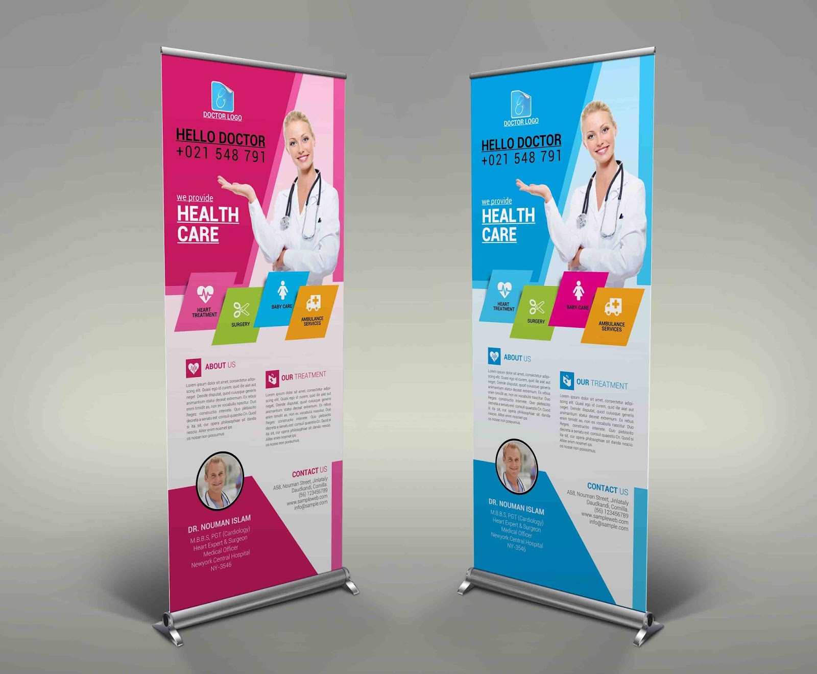
For people specifically comparing a medical doctor roll up banner template free download option with a paid design resource, evaluate the actual production quality rather than the label attached to the resource. Check dimensions, editable structure, image quality, typography, licensing terms, and whether the design can accommodate the information you genuinely need. A visually attractive layout is not useful if it cannot be adapted correctly.
A search for a medical doctor roll up banner template free may also reflect a desire to begin with a simple layout rather than commission a design from scratch. In that situation, prioritize clean structure and editability. Replace placeholder content carefully, remove unnecessary elements, and ensure that every photograph, logo, icon, and typeface is suitable for the intended use.
For people preparing a medical doctor roll up banner template free printable layout, remember that screen appearance and physical output are different experiences. Print a small proof when possible, inspect contrast and text clarity, and verify that the bottom content will not conflict with the hardware. A successful design is one that remains clear when physically produced, not merely one that looks attractive on a monitor.

Practical checklist before production
Review the headline first. Can someone identify the purpose of the banner in a few seconds? Then inspect the image. Does it support the message and remain sharp at the intended physical size? Next, review the service list. Are there only the most relevant services, and can each be understood without excessive reading?
After that, inspect the footer. Is the phone number correct? Is the address complete? Is the QR code large enough and surrounded by enough clear space? Is the website or other contact route correct? These small details often determine whether the banner turns attention into a useful interaction.
Finally, step away from the design and view it from the approximate distance at which visitors will encounter it. If the headline disappears, the text hierarchy is too weak. If the contact area dominates from a distance, it may be too visually heavy. If everything appears equally important, simplify the hierarchy before sending the file to production.

Design patterns worth borrowing
Several recurring patterns work well for medical displays. The first is the hero-image pattern, where a large portrait or medical photograph occupies the upper portion and the lower portion carries services and contact information. The second is the icon-list pattern, where several services are arranged vertically with small symbols and concise descriptions.
The third is the campaign pattern, where a single message dominates the entire design and supporting information remains deliberately limited. This works especially well for screening campaigns, health awareness events, clinic openings, or seasonal programs. The fourth is the institutional pattern, where the hospital or medical center identity is emphasized and the banner functions as a branded information panel.
None of these patterns should be copied mechanically. The best choice depends on viewing distance, audience, location, purpose, and amount of information. Use reference designs to understand how hierarchy works, then build an original arrangement around the actual needs of the physician or organization.

Keeping future edits manageable
A medical banner is rarely a one-time communication. Phone numbers change, doctors join or leave practices, services are added, campaign dates expire, and branding evolves. Build the working file so text, images, logos, icons, and background elements remain logically separated and easy to update.
Keep a clean master version without event-specific dates whenever possible. Create campaign variants from that master rather than repeatedly modifying the only existing production file. This reduces the risk of accidentally deleting essential brand elements or leaving outdated information in a future banner.
It is also useful to maintain a small content record containing the approved clinic name, physician names, specialties, telephone numbers, addresses, web addresses, and standard service descriptions. When a new banner is created, these details can be checked against the approved information before production.

Reference Examples
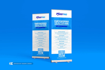
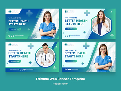
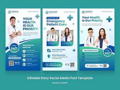
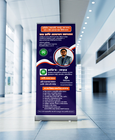
A medical doctor roll up banner Template is easiest to evaluate when you can compare different approaches to hierarchy, imagery, color, service presentation, and contact placement. The examples below show a range of medical and healthcare banner compositions, including clinic promotions, hospital displays, service-focused layouts, and vertically structured designs. They are useful as visual references for identifying what makes a banner readable, how much information can reasonably fit into a narrow format, and how designers balance branding with practical patient-facing information.
Use these visual references as starting points for analysis rather than as layouts to reproduce exactly. Look at where the headline sits, how the image interacts with the text, how services are grouped, and how the bottom contact area is separated from the main message. Comparing several approaches can help you decide whether your own medical doctor roll up banner Template should emphasize the physician, clinic, specialty, campaign, service list, or a specific action.

Modern Medicine Hospital Banner
Source: Dribbble
Empowering Healthcare Professionals Display
Source: Dribbble
Editable Medical Healthcare Banner Collection
Source: Dribbble
Healthcare Service Banner Layouts
Source: Dribbble

Medical Roll-Up Banner in Hospital Corridor
Source: Dribbble

Healthcare Roll-Up Banner Color Variations
Source: Dribbble

Medical Roll Up Banner
Source: Dribbble
Medical Service Roll-Up Display
Source: Dribbble

Hospital Information Roll-Up Banner
Source: Dribbble

Healthcare Medical Services Banner
Source: Dribbble
Choosing the right resource format
The best resource is the one that matches the editing workflow, production requirements, and skill level of the person responsible for the artwork. Someone preparing a simple internal clinic display may prefer a familiar office-oriented format, while a professional designer may need layered graphics, precise color control, vector elements, and a production-ready export.
Do not choose a resource solely because its filename contains a desired phrase. Inspect the actual layout and determine whether it has sufficient room for your content. Check the dimensions, editable elements, image quality, licensing terms, and intended production method before committing to it.
A good template should save planning time without forcing you to compromise the message. If replacing the placeholder information requires extensive reconstruction, the design may not actually be saving time. Conversely, a well-organized layout with sensible content zones can accelerate several future campaigns while keeping the visual identity consistent.
For a physician or clinic building a reusable set of displays, the most valuable approach is usually to establish one strong master layout and create controlled variations for specialties, services, events, and campaigns. That creates a coherent family of banners while allowing each display to communicate a distinct message.
The central principle remains simple: a medical roll-up banner succeeds when a viewer can identify who is communicating, understand the main message, recognize the relevant service or benefit, and find the next action without struggling through excessive information. A carefully structured template makes that communication easier, while thoughtful editing turns the template into a professional representation of the medical practice.
