An agency-facing cover is more than a decorative first page. It is the visual entry point to a business plan, proposal, service document, insurance packet, capability statement, or internal planning file. For readers searching for agency business cover Template , the practical need is usually to find a clean structure that can be adapted to an agency brand without losing the hierarchy of information. A strong cover should identify the organization, name the document, establish the relevant period or submission date, and make the document easy to recognize when printed or stored digitally.
The best cover designs are restrained. They use one dominant title, a clear organization name, a controlled color palette, and enough open space to prevent the page from looking crowded. A cover does not need to explain the whole business; its job is to orient the reader. This distinction is especially useful when an agency maintains several document families, such as strategic plans, insurance records, proposals, market studies, and client-facing reports.
A useful agency business cover Template also creates consistency across the organization. When the same logo position, typography, spacing, page size, and information hierarchy are repeated, documents look related even when their purposes differ. Current template libraries show a wide range of cover approaches, from minimalist geometric layouts to formal report designs, while staffing-plan resources commonly emphasize executive summaries, target markets, service models, operations, marketing, and financial planning.
What an agency business cover should accomplish
The first responsibility of a cover is identification. A reader should be able to tell what the document is, who prepared it, and which organization owns it without studying the page for several seconds. The primary title should therefore receive the strongest visual emphasis. A secondary line can identify the document type, business unit, reporting period, or intended audience. Contact information may be included when the document is designed for external circulation, but it should remain secondary to the document title and organization identity.
The second responsibility is hierarchy. A cover has limited visual space, so every element should have a reason to exist. A common hierarchy is organization name at the top, document title in the central area, subtitle or purpose beneath it, followed by prepared-by details and date. This arrangement works for many agency documents because it separates identity from purpose and purpose from administrative information.
The third responsibility is brand recognition. Agencies often compete on credibility, specialization, reliability, or a distinct service proposition. The cover should reinforce those qualities through design rather than trying to state every advantage in a paragraph. A consulting agency might use a restrained corporate layout, while a creative agency may use stronger shapes, color, or imagery. A staffing agency may benefit from a more formal presentation because its documents can be reviewed by employers, candidates, investors, lenders, or strategic partners.

One important principle is separation between the cover and the substantive document. The cover should not become an overcrowded summary page. If the reader needs an executive summary, financial overview, market analysis, or operating plan, those sections should begin after the cover. Keeping the first page visually focused makes the entire document feel more deliberate and easier to navigate.
Another useful principle is repeatability. A cover that looks attractive but is difficult to update can create unnecessary work. Agency documents often change names, dates, service categories, geographic focus, or reporting periods. A practical design leaves predictable areas for those fields so that revisions do not require rebuilding the page from scratch.
Finally, the cover should match the document’s purpose. A client proposal, strategic plan, insurance record, staffing plan, and internal operating document may share a visual identity but should not necessarily look identical. The agency brand can remain consistent while the subtitle, supporting information, imagery, and color accents distinguish each document family.
Essential elements to place on the cover
A professional cover usually begins with the agency’s legal or trading name. Use the form that matches the rest of the document and avoid switching between abbreviations, shortened names, and formal names without a reason. If the document is intended for external review, consistency is especially important because the cover may become the first reference point for a client, lender, insurer, or partner.
The document title should be specific enough to explain the file’s purpose. “Business Plan” may be suitable for a general planning document, but “Agency Business Plan,” “Strategic Growth Plan,” “Insurance Planning Record,” or “Client Services Proposal” can provide more immediate context. If a reporting year, project name, or geographic area is important, it can be included as a secondary line rather than competing with the main title.
Prepared-by information is useful when several people or departments may create documents under the same agency brand. A simple line such as “Prepared by,” followed by a role or department, can establish responsibility without turning the cover into a contact sheet. For externally shared documents, the agency’s primary contact details may be added below this information if they are genuinely useful to the recipient.
- Agency name: the organization responsible for the document.
- Document title: the clearest description of the document’s purpose.
- Subtitle: optional context such as a service area, plan period, or project name.
- Prepared by: an individual, department, or business unit when relevant.
- Date: the preparation, submission, or reporting date.
- Brand mark: a logo or restrained identity element that supports recognition.
- Version detail: useful when several revisions circulate simultaneously.

Choosing the right layout and visual style
Minimal layouts work particularly well for professional agencies because they emphasize information rather than decoration. A restrained cover may use a white background, a single dark accent, one geometric shape, and a strong title. This style is suitable when the document may be printed frequently, attached to formal correspondence, or reviewed by people who expect a conventional business presentation.
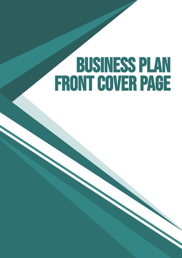
Geometric layouts create a stronger visual identity while remaining professional. Diagonal bands, blocks, circles, and controlled overlays can frame a title without competing with it. The key is repetition: if the agency uses a geometric motif on its website, proposal pages, letterhead, and presentations, the cover can extend that identity naturally.
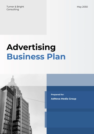
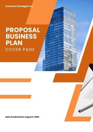
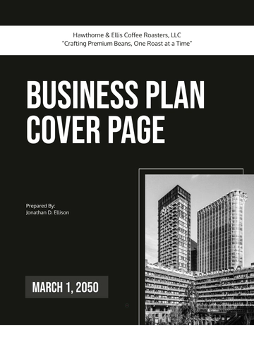
Photography can also work, especially for agencies whose services are connected to a specific industry or environment. However, the image should support the document rather than function as decoration. A consulting agency might use an architectural or abstract business image, while a property-focused agency could use a building image. If the visual contains text, make sure the cover title remains readable and that the image does not create a busy background behind important information.
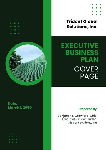
Color selection should also be intentional. Two or three related colors are usually easier to manage than a large palette. Dark blue, charcoal, gray, green, or muted earth tones can create a formal appearance, while brighter accents can emphasize headings or brand details. The best choice depends on the agency’s existing identity rather than a universal rule.
Typography should be equally controlled. One strong display typeface paired with a highly readable body typeface is usually sufficient. Avoid using several decorative fonts on the cover. The title should remain legible at a glance, while small administrative details should be large enough to remain readable in a printed version.
Page proportions matter too. A4 is common in many international business settings, while Letter is common in the United States. The cover should be designed for the page size that matches the final document rather than resized as an afterthought. Margins, image placement, and title positioning can change noticeably when a design moves between formats.
Using the cover with different document formats
Many readers search for an agency business cover template word because Microsoft Word is a practical choice for documents that need frequent text editing. Word works particularly well when the cover is part of a larger report and the same file will contain the plan, headings, page numbers, charts, and supporting sections. When preparing such a document, keep the cover simple enough that later edits do not disturb the alignment of the main title.
Others search for an agency business cover template google docs because collaborative editing can be useful when several contributors are reviewing the same business plan. A collaborative document should use stable formatting, consistent headings, and clearly defined editable fields. Avoid placing critical information inside complicated objects that other contributors may accidentally move.
An agency business cover template excel search reflects a different use case. Excel is primarily useful when the document is closely connected to financial schedules, projections, budgets, or operational worksheets. In that situation, a cover can still be created as the first worksheet or as a presentation page, but the visual structure should support the spreadsheet’s purpose rather than imitate a long-form report too closely.
An agency business cover template pdf search generally signals the need for a fixed presentation format. A PDF preserves the visual arrangement of the finished document more consistently than an editable source file, which is useful when a finalized plan is being reviewed or archived. The important distinction is that the PDF should be treated as the presentation version after the underlying information has been checked.
When an agency needs a reusable design, it is helpful to maintain a master source and a controlled final version. The master can contain editable fields, while the final version can be issued only after names, dates, figures, contact details, spelling, and branding have been checked. This simple separation reduces the risk of accidentally distributing an outdated document.
How an agency cover connects with a business plan
A cover is only the first layer of a larger planning document. A strong agency business plan template normally needs to support decisions about the agency’s purpose, target customers, services, competitive position, marketing, operations, management, and financial assumptions. The cover should visually prepare the reader for that structure without trying to reproduce it.
The executive summary usually follows the cover and explains what the agency does, whom it serves, how it expects to create value, and what it wants to achieve. The company overview can then explain ownership, structure, history, location, specialization, and operating model. Market analysis should establish the relevant customer groups and competitive environment using information that can be verified rather than assumptions presented as facts.
For a staffing or recruitment agency, the business plan needs additional operational detail. A business plan for a staffing agency template should help organize the service model, target employers, recruiting process, candidate pipeline, pricing or placement structure, sales strategy, payroll considerations, staffing needs, and financial planning. Industry-specific planning resources commonly emphasize these areas because staffing businesses have operating characteristics that differ from many other service firms.
The cover for a staffing plan should therefore communicate professionalism and clarity rather than rely on generic recruitment imagery. A restrained title, agency name, plan period, and prepared-by field are often enough. The substantive sections can then explain the staffing niche, employer segments, candidate sourcing process, service fees, operating costs, sales pipeline, and financial assumptions.
For a new agency, an agency business start template can be useful as a planning framework when it includes practical sections rather than only a decorative cover. Early planning should clarify the agency’s service proposition, ideal customer, startup resources, operating responsibilities, acquisition strategy, and expected cash requirements. The cover should reflect that planning stage while remaining suitable for later revisions.

Cover design for insurance and risk documents
An agency business insurance plan template serves a different purpose from a general business plan. Insurance-related documentation may need to organize information about the agency’s operations, exposures, policies, limits, renewal dates, claims information, or risk-management procedures. The cover should clearly identify the document and its effective period while avoiding any suggestion that a generic layout itself satisfies an insurer’s requirements.
Insurance documentation should be checked against the actual instructions provided by the insurer, broker, regulator, client contract, or other authoritative source relevant to the situation. A cover design can organize information, but it does not establish coverage, determine legal obligations, or replace professional advice. If a specific organization requires a particular form or filing structure, that requirement should be verified independently.
For agencies operating in different jurisdictions, geographic information may also matter. A search for agency business cover template california, for example, can indicate that the reader wants a document oriented toward a California-based agency. The visual design can identify the service area, but jurisdiction-specific legal, insurance, licensing, employment, or tax requirements should be confirmed from authoritative sources before being incorporated into a formal document.

A useful risk-document cover can include the agency name, document title, coverage or planning period, internal reference number, responsible department, and revision date. Avoid placing sensitive policy numbers, personal information, or confidential financial details prominently on a cover when the document may be circulated widely.
Version control is especially important for risk and insurance records. If several versions exist, the cover can display a revision identifier and date so that users can distinguish a current record from an earlier draft. The same principle applies to strategic plans and client proposals, where an outdated cover can create uncertainty about whether the underlying figures and assumptions are still current.
How to build a professional agency cover from scratch
Start by defining the document’s audience. A client-facing proposal needs a polished and persuasive first impression, while an internal operating plan may prioritize clarity and quick recognition. A lender-facing plan should look formal and organized. Identifying the reader before choosing colors, imagery, and typography prevents the design from becoming disconnected from the document’s purpose.
Next, list the information that genuinely belongs on the first page. Keep the organization name, title, subtitle, date, and prepared-by information if relevant. If the document has a confidential status, revision code, or project reference, decide whether that information belongs on the cover or in a header. Reducing the number of elements makes it easier to establish a strong hierarchy.
Then choose a visual system. Select the agency’s existing brand colors where possible, define a consistent logo position, and choose one main title style. If photography is used, select a single image with enough negative space for the title. If a geometric design is used, repeat its shapes sparingly so that the cover feels intentional rather than busy.

After the first draft is complete, test the cover at its actual reading size. A design that looks impressive when enlarged on a monitor may become difficult to read when printed. Check the contrast of the title, the legibility of small text, the alignment of the logo, the amount of white space, and the visual balance between the top and bottom portions of the page.
Finally, compare the cover with the next several pages. The transition should feel coherent. If the cover uses dark blue and geometric accents but the rest of the document suddenly changes to unrelated colors and fonts, the document can appear assembled from separate sources. A simple style guide for headings, colors, page numbers, charts, and callouts can solve this problem.
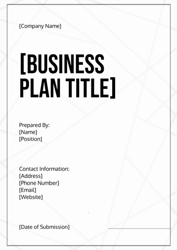
Common mistakes that weaken agency covers
The most common mistake is overcrowding. Adding every contact detail, service category, slogan, registration detail, social address, and document note can make the cover resemble a flyer instead of a professional report. Move secondary information into the document itself unless the reader genuinely needs it on the first page.
Another mistake is using a visual that competes with the title. A highly detailed photograph or complicated background may look attractive on its own but can reduce readability. If an image is important to the agency’s identity, use a crop or overlay that creates enough contrast for the document title.
Inconsistent terminology is another problem. An agency should decide whether it calls the document a plan, proposal, report, strategy, or profile and then use that terminology consistently. The same applies to the agency name, department name, dates, and version labels.
- Do not use too many fonts or unrelated type styles.
- Do not place critical text over visually complex areas.
- Do not make the title smaller than secondary decorative elements.
- Do not mix different agency names across the same document.
- Do not leave placeholder names, dates, or contact fields in a final version.
- Do not assume a visually polished cover satisfies a legal, insurance, lender, or regulatory requirement.
- Do not use confidential information on a cover when broad circulation is possible.

Practical Solution
A practical workflow for creating an agency business cover Template begins with a content-first outline. Write down the agency name, document title, subtitle, date, responsible person or department, and any necessary reference number. Do not begin with decoration. Once the information hierarchy is clear, choose a layout that gives the title the greatest visual weight and keeps administrative information secondary.
The second step is to create a reusable master design. Set the page size, margins, logo area, title area, date position, and brand colors once. Then create variations for a business plan, client proposal, strategic report, insurance record, or company profile. The variations should feel like members of the same document family rather than unrelated designs. This approach makes future revisions more predictable and reduces unnecessary formatting work.
The third step is quality control. Read every word on the cover, compare names against the underlying document, verify dates, inspect the logo, and confirm that the final page size matches the intended output. Review the cover both on screen and as a printed page when physical presentation matters. For external documents, check that no confidential information has been placed in a prominent location.

The fourth step is to connect the cover to the document structure. If the cover says “Agency Business Plan,” the next pages should follow a logical sequence such as executive summary, company overview, services, market analysis, competitive positioning, marketing and sales, operations, management, risk considerations, and financial planning. If the document is a proposal, the following sections should instead emphasize the client’s needs, proposed services, scope, delivery approach, commercial terms, and next steps.
The final step is version discipline. Keep one clearly identified master source and generate final presentation copies only after review. Record the revision date when the document changes materially. This is particularly helpful when multiple people collaborate on plans, proposals, insurance records, or client documents. The result is not merely a better-looking cover; it is a more reliable document-management process.
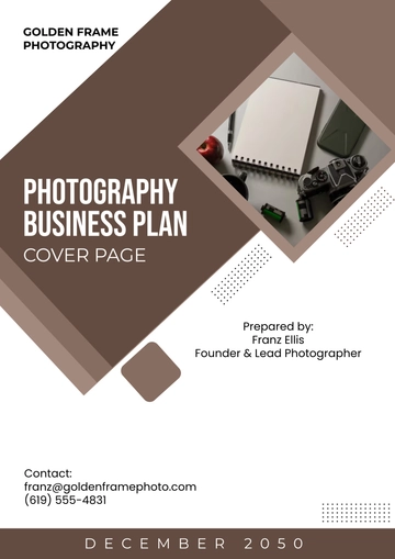
How to evaluate an existing agency cover
Evaluation should begin with a five-second test: can a reader identify the agency and document purpose almost immediately? If not, the hierarchy needs improvement. The title may be too small, the organization name may be difficult to locate, or the visual elements may be competing for attention.
The second test is information accuracy. Compare the cover against the first substantive page and the document metadata. The business name, plan period, project title, prepared-by information, and revision details should agree. A beautiful design cannot compensate for inconsistent information.
The third test is reproduction quality. View the cover on a normal desktop display, a smaller screen, and a printed page when relevant. Look for faint text, low contrast, clipped graphics, excessive margins, or images that lose clarity. A professional cover should remain understandable even when the document is viewed in less-than-ideal conditions.
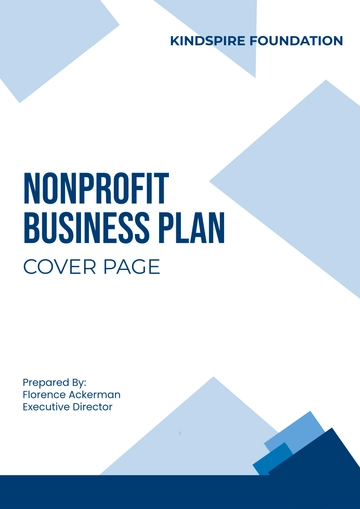
The fourth test is brand consistency. Compare the cover with the agency’s other formal materials. Consistency does not require every page to look identical, but the organization should have recognizable typography, colors, logo treatment, and spacing conventions. A consistent visual language can make separate documents appear more trustworthy and organized.
The fifth test is purpose alignment. A cover for a creative proposal can be expressive, while an insurance planning document may need a more restrained treatment. A staffing plan may benefit from strong information hierarchy and formal presentation. The correct design is therefore not necessarily the most colorful or visually complex; it is the one that supports the reader’s reason for opening the document.

Business planning visuals that can strengthen the document
Once the cover is complete, visual consistency can continue inside the business plan. A business model diagram can explain how the agency creates value, reaches customers, manages key resources, and generates revenue. Such visuals are particularly useful when the agency’s operating model is easier to understand as a system than as several disconnected paragraphs.
Business model canvases can also help an agency pressure-test its assumptions. The major areas typically address partners, activities, resources, value propositions, customer relationships, customer segments, channels, cost structure, and revenue streams. These areas can be adapted to agency work by considering referral partners, service delivery, specialist staff, target clients, acquisition channels, operating costs, and service fees.
The visual should support the written plan rather than replace it. A diagram may show the relationships among parts of the business, while the written sections explain the evidence, assumptions, decisions, and actions behind those relationships. This distinction keeps the document useful for both quick review and detailed analysis.

Using examples without copying another agency’s identity
Visual references are useful for studying structure, not for duplicating another organization’s identity. When reviewing an existing cover, look at how the title is positioned, how much space is reserved for branding, how the date is presented, how colors are balanced, and how imagery supports the hierarchy. Those observations can inform an original design without reproducing someone else’s distinctive branding.
Reference material is particularly valuable when an agency is deciding between several directions. A minimalist design can be compared with a geometric corporate design, a photographic report cover, or a formal strategic-plan layout. The decision should be based on audience, document purpose, agency identity, and reproduction needs.
It is also useful to distinguish between a true template and a visual example. A template is structured around fields that can be changed, while an example may simply demonstrate a finished composition. When selecting a design for repeated agency use, prioritize editable structure, clear hierarchy, and predictable spacing over decorative complexity.

Reference Examples
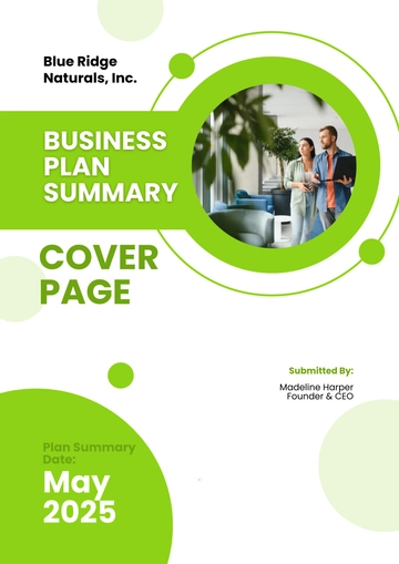
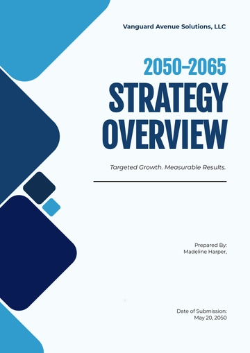
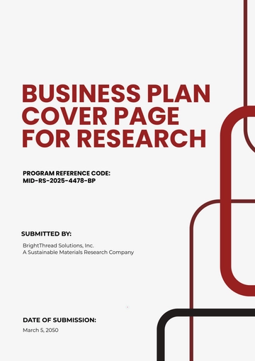
An agency business cover Template is easiest to evaluate when readers can compare several real document-cover structures side by side. The most useful references reveal how professional covers balance identity, title hierarchy, supporting details, whitespace, imagery, and visual consistency. Some examples emphasize typography and geometric shapes, while others use photographs or diagrams to establish context. These differences are valuable because an effective agency cover does not have one universal appearance. The right structure depends on whether the document is a business plan, proposal, strategic report, insurance record, company profile, or another formal agency document.
The following visual references show different approaches to business-plan and agency-document presentation. They can help readers recognize useful patterns such as strong title placement, restrained color systems, clear prepared-by fields, organized business-model diagrams, and professional report-cover composition. They should be treated as design references rather than as claims about required formats. When adapting an example, retain the agency’s own identity, verify every piece of information, and make sure the finished cover matches the purpose and audience of the underlying document.
Business Plan Summary Cover Page
Source: Template.net
Modern Hair Salon Business Plan Cover Page
Source: Template.net
Entrepreneur Business Plan Cover Page
Source: Template.net

Startup Business Plan Cover Page
Source: Template.net

School Business Plan Cover Page
Source: Template.net
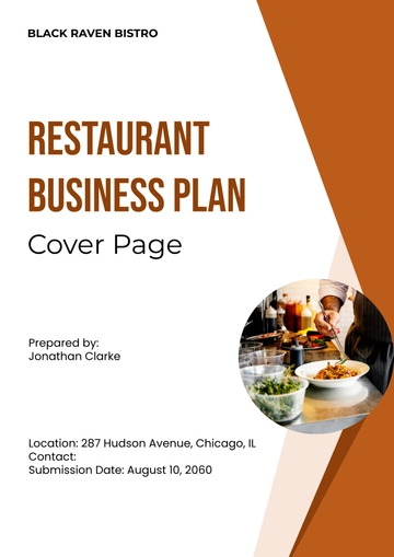
Restaurant Business Plan Cover Page
Source: Template.net

Colorful Food Truck Business Plan Cover Page
Source: Wikimedia Commons

Mitel Annual Report 1981
Source: Wikimedia Commons
