Modern businesses use automated reporting for sales performance, financial reviews, operational monitoring, marketing analysis, customer activity, project progress, inventory, and management reporting. The underlying principle is simple: collect reliable source data once, standardize the calculations, and let the reporting structure update as new information is added. Automation does not remove the need for judgment; it gives people more time to interpret results and act on them.
This guide explains how to design an automated business report template from the ground up, when to use Excel or Google Sheets, how to structure calculations, how to create useful dashboards, how to automate recurring reporting tasks, and how to avoid common spreadsheet problems. It also explains how free templates can be evaluated before they are adopted as part of a real reporting workflow.
The best reporting systems are not necessarily the most complicated. A small company may need only a source-data sheet, KPI calculations, a summary dashboard, and a management commentary section. A larger organization may require multiple data sources, controlled definitions, refresh procedures, exception alerts, role-based views, and an audit trail.
Throughout the article, examples are presented as practical scenarios rather than claims about any particular company. The objective is to help readers build a repeatable reporting process that produces useful information without turning every reporting cycle into a manual spreadsheet project.
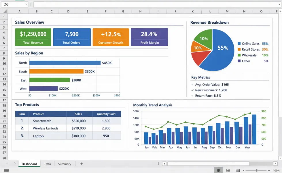
Source: Rowspeak
What Is an Automated Business Report Template?
An automated business report template combines a repeatable report structure with formulas, data connections, calculated fields, charts, and predefined presentation rules. The template acts as the reporting layer between raw business information and the people who need to understand it.
A conventional report may require a person to copy numbers from several files, calculate totals, compare current results with previous periods, update charts, write a summary, and check the final document. An automated template moves as many of those repetitive steps as practical into formulas or refreshable data processes.
Automation can exist at different levels. A basic spreadsheet may automatically calculate totals and percentages. A more advanced workbook may refresh pivot tables and dashboards. A connected reporting system can import information from accounting, CRM, advertising, ecommerce, or operational systems and then generate a standardized management view.
The template itself is important because automation without structure can simply produce faster confusion. If different departments define revenue, customers, leads, or reporting periods differently, automated calculations can reproduce those inconsistencies at scale. A strong template therefore combines technical automation with clear business definitions.
For that reason, an automated business report template should be treated as a small reporting system rather than a decorated spreadsheet. Its quality depends on data structure, formulas, controls, documentation, visual design, ownership, and the decisions the report is intended to support.
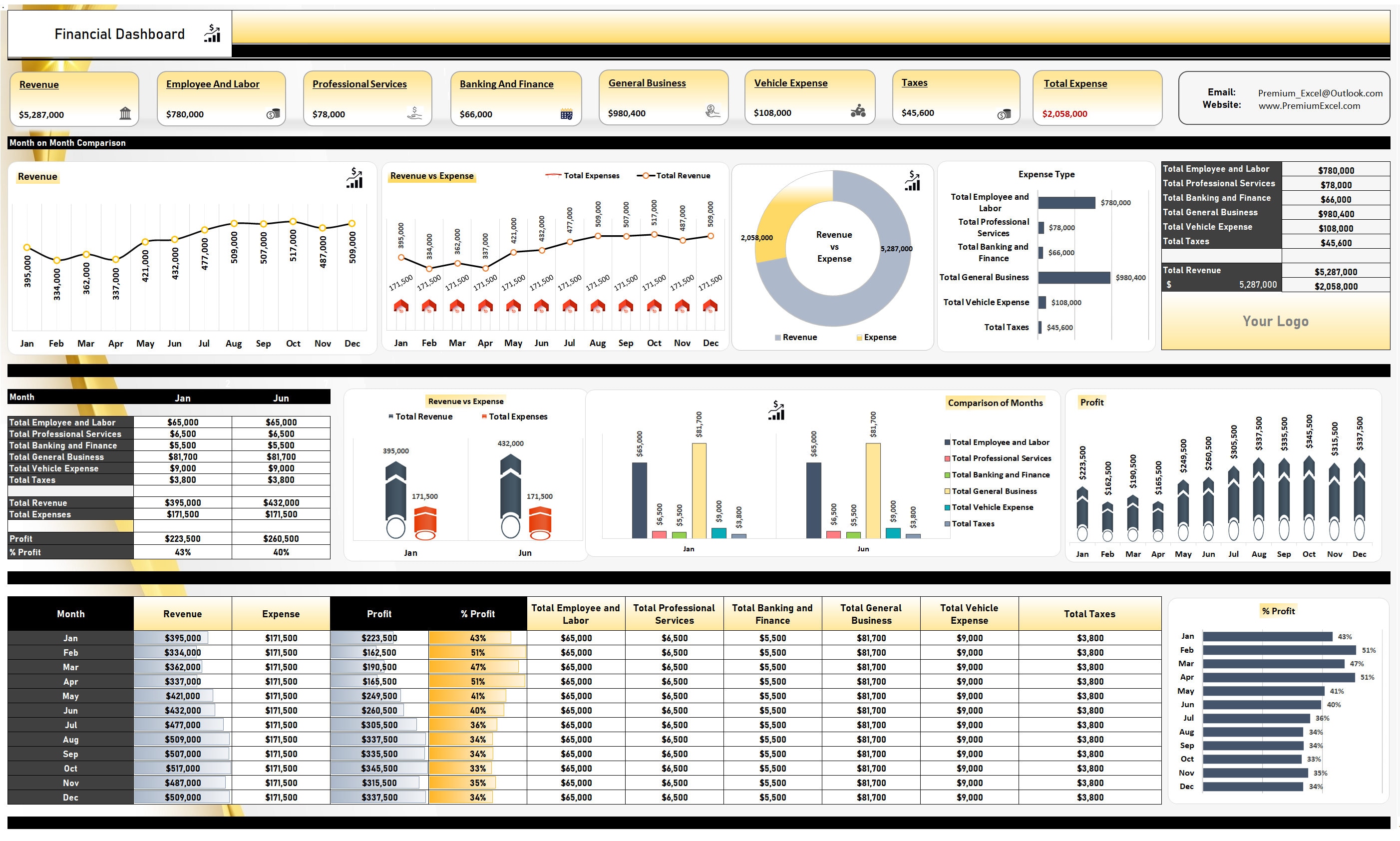
Source: Etsy
Why Automated Business Reporting Matters
Recurring business reporting often consumes time because the same calculations are performed repeatedly. Even when the underlying data changes only slightly, someone may still need to copy figures, check formulas, rebuild charts, format tables, and distribute the report.
Automation addresses this repetition by separating stable report logic from changing business data. The layout, formulas, chart definitions, and KPI rules can remain consistent while new transactions or period results are added to the input layer.
Consistency is another major benefit. A standardized reporting template makes it easier for two managers reviewing different periods to understand the same metrics in the same locations. Consistent definitions also reduce disputes about whether a number was calculated differently this month than last month.
Automated reporting can also improve reporting speed. When the source data is ready and the formulas are correctly designed, a monthly report can often be refreshed instead of rebuilt. The time saved can then be used for variance analysis, investigation, forecasting, and decision-making.
Automation should not be confused with automatic accuracy. A formula can calculate the wrong metric perfectly. A dashboard can display incomplete data beautifully. The objective is therefore not simply to automate more tasks, but to automate stable, well-defined processes while keeping appropriate human review points.
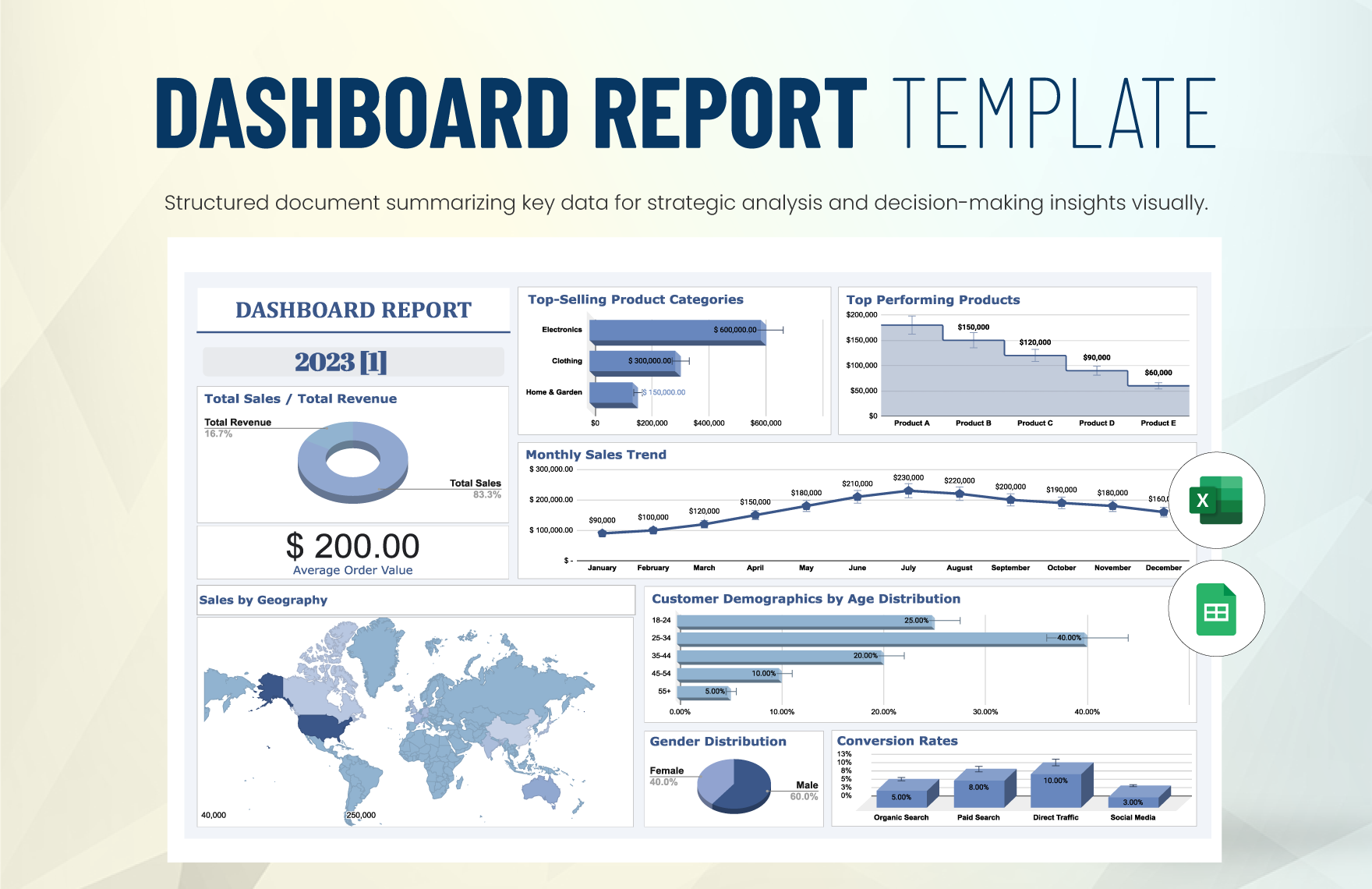
Source: Template.net
Core Components of an Automated Business Report Template
A practical template normally begins with a clearly separated source-data area. This area contains the records from which the report is calculated. Typical fields can include date, department, customer, product, region, transaction type, quantity, revenue, cost, status, owner, and other dimensions relevant to the business.
The second layer is the calculation layer. This is where formulas transform source information into metrics such as revenue, gross profit, conversion rate, average order value, utilization, completion rate, budget variance, or year-over-year change. Keeping calculations separate from raw input makes troubleshooting easier.
The third layer is the reporting layer. It converts calculated values into tables, KPI cards, charts, trend comparisons, rankings, and exception indicators. The reporting layer should focus on what decision-makers need to see rather than exposing every available field.
A commentary or interpretation layer is also valuable. Numbers alone do not explain why a result changed. A management report should provide room for explanations of major variances, unusual events, risks, corrective actions, and decisions required from stakeholders.
Finally, the template should include documentation. A short instructions area can explain where users enter data, which cells are formula-driven, what each KPI means, how often the report should be refreshed, and who owns the reporting process.
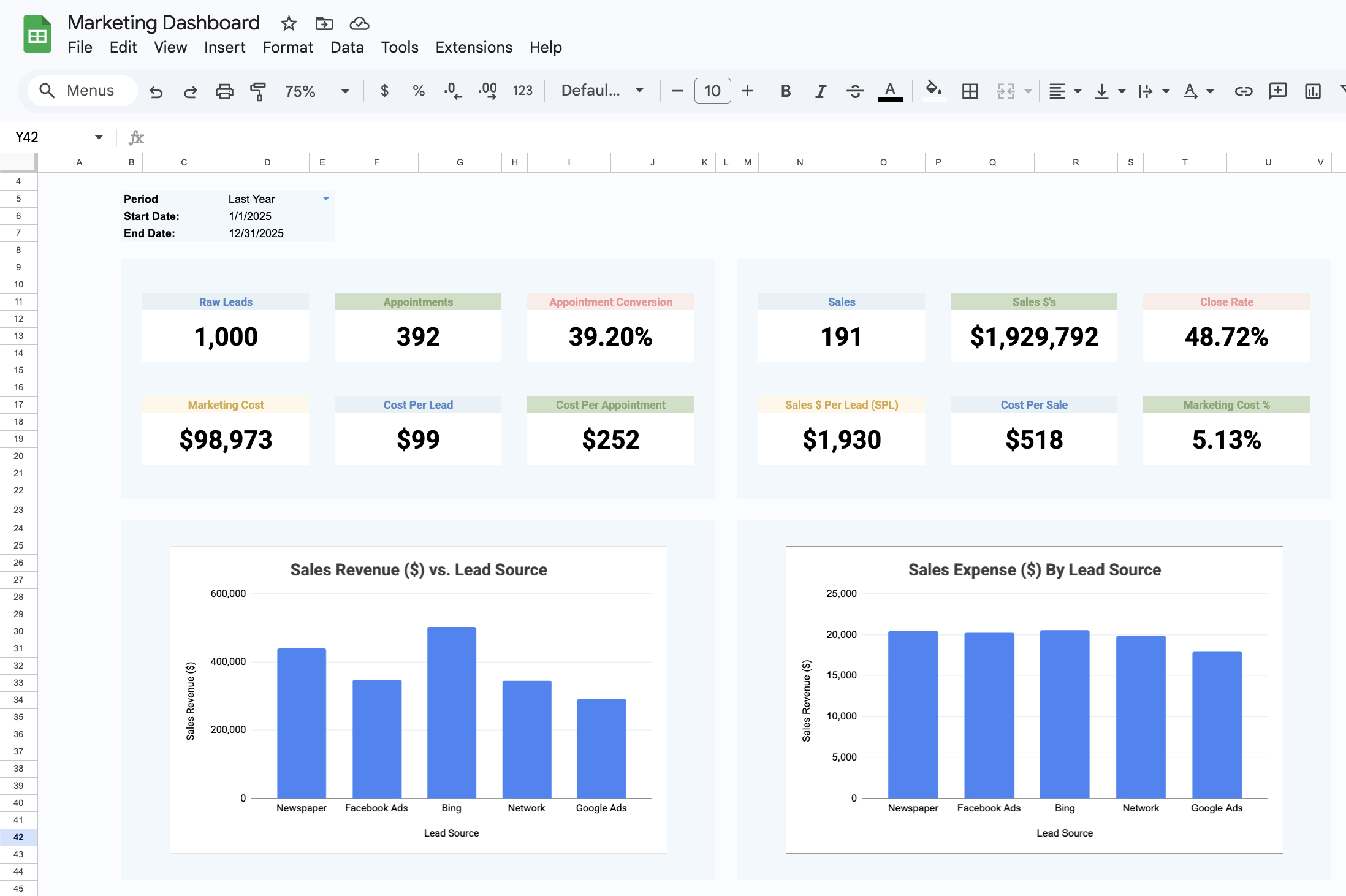
Source: SheetMetricz
How to Structure the Data for Automation
The quality of an automated report depends heavily on how its underlying data is organized. A table should normally use one row per record and one column per field. This structure is much easier to filter, aggregate, query, pivot, and extend than a visually formatted report where headings and totals are mixed into the transaction data.
Dates should be stored as real dates rather than inconsistent text labels. Numeric fields should contain numbers rather than currency symbols typed into cells. Categories should use standardized names. For example, “North Region,” “North,” and “NORTH” should not accidentally represent three different categories.
Unique identifiers are also useful. A transaction ID, order number, project code, or customer ID can help identify duplicates and connect records across different datasets. When multiple sources are combined, identifiers make it easier to investigate mismatches.
Input validation can reduce errors before they reach the dashboard. Dropdown lists can standardize categories, date validation can prevent impossible periods, and required fields can make missing information easier to detect.
Good data structure also improves future scalability. A report designed around a proper source table can often accommodate thousands of additional rows without requiring a redesign. A report built around manually positioned totals and copied ranges is much more likely to break as the business grows.
Source: Getty Images
Building an Automated Business Report Template in Excel
Excel remains a practical choice for many organizations because it supports formulas, tables, pivot tables, charts, Power Query, conditional formatting, data validation, and a wide range of business analysis functions. Microsoft also provides dashboard-building capabilities that combine charts, tables, KPI indicators, slicers, and filters.
Start by creating a dedicated input table. Avoid placing manually entered values directly into the dashboard. The input table should contain the detailed records needed to calculate the report and should expand naturally as new records are added.
Next, define calculated fields. For a sales report, these might include net sales, cost, gross profit, margin, units sold, and order count. For an operations report, the fields might instead include completed tasks, open tasks, average processing time, backlog, and exception count.
Then create summary calculations using structured formulas, pivot tables, or Power Query transformations. The important principle is that the report should update when the source data changes without requiring the user to rewrite formulas across the workbook.
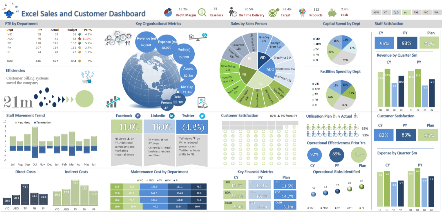
The final Excel dashboard should emphasize decision-useful information. A management view might show revenue, profit, margin, target attainment, major variances, and trends. Detailed transactions can remain in supporting sheets so that the executive view stays readable.
Source: TheSmallman
Using Google Sheets for Automated Business Reporting
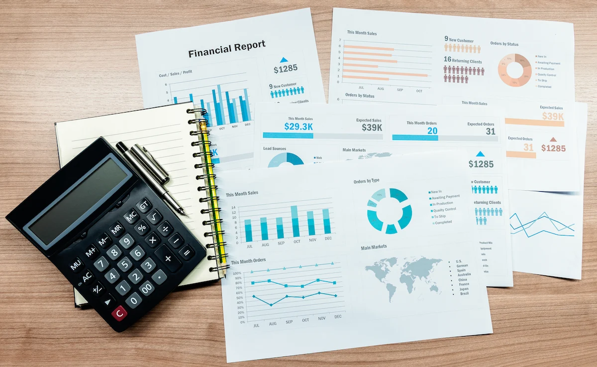
Google Sheets is useful when reporting requires collaboration, browser-based access, shared ownership, and frequent review by distributed teams. Its spreadsheet structure is familiar to many users, while cloud-based sharing makes it easier for several stakeholders to work from a common reporting file.
A Google Sheets reporting system can separate source data, calculations, dashboard views, assumptions, and documentation into different tabs. This structure makes the workbook easier to navigate and reduces the risk that users accidentally overwrite formulas.
Google Sheets also works well when a report must be shared with managers who do not need editing access. Permissions can help separate people who provide data from people who review the resulting report.
For more advanced workflows, organizations may connect Sheets to external sources or use automation services to move data into standardized tabs. The exact integration depends on the source system and the organization’s technical requirements.
The main design principle remains the same: users should not have to rebuild the report every time the reporting period changes. A good template changes the data, not the entire reporting architecture.
Source: Pegadaian
Choosing Between Excel and Google Sheets
Excel is often preferable when users need sophisticated workbook functionality, advanced data transformation, desktop performance, or compatibility with established finance and operations processes. It is also a strong option when reports depend heavily on features available in the Microsoft ecosystem.
Google Sheets can be preferable when multiple users need simultaneous access, when collaboration is central to the workflow, or when the reporting process is already organized around cloud-based Google services.
Neither platform automatically produces a better report. A poorly designed Google Sheet can be more difficult to maintain than a well-structured Excel workbook, while a complex Excel model can become unnecessarily difficult for a team that only needs a simple collaborative dashboard.
The decision should therefore be based on data volume, collaboration needs, integration requirements, user skills, security controls, refresh frequency, and the complexity of the calculations.
If a business already has a reliable reporting process in one platform, switching platforms only for appearance may create more risk than value. Improve the process first, then consider whether a platform change solves a genuine limitation.
Source: Pexels
Key Metrics to Include in a Business Report
A useful report begins with business questions rather than a long list of available metrics. For example, a sales manager may need to know whether revenue is on target, which channels are producing results, whether pipeline coverage is sufficient, and where conversion performance has changed.
Financial reports may emphasize revenue, gross profit, operating expenses, cash position, margin, budget variance, and forecast performance. Operational reports may focus on throughput, backlog, service levels, turnaround time, utilization, incidents, and unresolved exceptions.
Marketing reports can include leads, conversion rates, acquisition costs, campaign performance, traffic, engagement, and qualified opportunities. Customer reports might focus on retention, churn, satisfaction, support volume, renewal status, and customer value.
Every KPI should have a clear definition. If a metric is called “conversion rate,” the report should specify the numerator, denominator, timeframe, and population being measured. Without this definition, different users may calculate the same label differently.
Targets should also be documented. A KPI becomes more useful when current performance can be compared with a target, previous period, prior year, forecast, or benchmark that is appropriate for the business context.

Source: Pexels
Automating a Business Report: A Step-by-Step Workflow
Automating a business report should begin with process mapping. Document what happens today from the moment data is collected to the moment the final report reaches its audience. Identify manual copying, repeated calculations, chart updates, file merging, email preparation, and review steps.
Next, classify each task. Some steps should be automated because they are repetitive and rules-based. Others should remain human because they require interpretation, judgment, context, or approval. This distinction prevents over-automation.
After the process is mapped, standardize the inputs. Decide where data comes from, which fields are required, how categories are named, which dates define reporting periods, and how missing or corrected records are handled.
Then build the calculation engine. Every recurring metric should have a documented formula or calculation rule. Test calculations against manually checked examples before connecting them to the executive dashboard.
Finally, automate refresh and distribution where appropriate. The report should have a defined schedule, owner, validation checkpoint, and recipient list. Automation is most reliable when there is still a clear person responsible for confirming that the output makes sense.

Source: Pexels
Data Collection and Source Management
Automated reporting works best when source data is predictable. A report that receives inconsistent exports every month will require manual intervention even if the dashboard itself is automated.
For each source, document the owner, update frequency, expected fields, file format, date coverage, and validation rules. This creates a simple data contract between the source and the reporting process.
When multiple sources are combined, define how they relate. A sales dataset may connect to customer records through a customer ID, while advertising results may connect to campaigns through a campaign identifier. Explicit relationships are safer than manual matching.
Duplicate detection is particularly important. If a transaction appears twice, an automated report may double revenue or volume without generating an obvious technical error.
Missing-data rules should also be documented. A blank value may mean zero, unavailable, not applicable, or not yet received. Those meanings are not interchangeable and can materially change report results.

Source: Pexels
Data Analysis and Variance Reporting
An automated report should do more than display totals. Its strongest value comes from helping readers identify what changed, where it changed, and why the change deserves attention.
Variance analysis is one of the simplest ways to add decision value. Compare actual performance with budget, target, previous period, prior year, or forecast. The comparison should use a relevant baseline rather than a number chosen merely because it is available.
Trend analysis is also useful. A single month can be misleading when viewed alone, whereas a rolling twelve-month view can reveal seasonality, gradual deterioration, sustained growth, or unusual spikes.
Segmentation helps identify where the overall result comes from. Revenue may be stable overall while one region declines and another grows. A dashboard that reports only the total could hide this important difference.
Exception reporting should direct attention toward results that require investigation. Instead of forcing managers to inspect every row, the report can flag values that fall outside defined thresholds or patterns.

Source: Pexels
Dashboard Design for Automated Reports
A dashboard should answer the most important questions quickly. The first screen should normally contain the few KPIs that determine whether the business, department, project, or process is performing as expected.
KPI cards are useful for high-level numbers such as revenue, profit, order volume, completion rate, or target attainment. They should be accompanied by context such as period, comparison, and target where appropriate.
Line charts are effective for trends over time, while bar charts are often useful for comparing categories. Pie or donut charts can work for simple composition views, but they become difficult to interpret when there are many categories.
Tables remain valuable when exact numbers matter. A dashboard does not need to turn every result into a chart. A concise variance table may communicate more clearly than a decorative visualization.
Visual hierarchy matters as much as chart selection. Important information should be visually prominent, secondary detail should be quieter, and unnecessary decoration should be removed. The purpose is to improve comprehension rather than impress the viewer.

Source: Pexels
Example of a Monthly Automated Business Report
Consider a hypothetical service company that wants a monthly management report. Its source data contains invoices, customer records, service tickets, employee assignments, and operating costs.
The first section of the report could show revenue, gross margin, active customers, completed service requests, average resolution time, and overdue requests. Each KPI would be calculated automatically from the underlying tables.
The second section could compare the current month with the previous month and the annual target. A variance column would highlight material movements while a short commentary field would explain the most important changes.
The third section could provide department or region comparisons. Managers could see which locations contributed to growth, where service delays increased, and which categories created the largest cost variance.
The final section could list actions. For example, an unusual increase in unresolved service requests might trigger a staffing review, while a decline in a profitable customer segment might require a commercial investigation.

Source: Pexels
Using a Business Report Template Free of Cost
A business report template free resource can be useful when the objective is to establish a reporting structure without purchasing specialized software. Free templates can provide examples of layouts, formulas, dashboards, and common report sections.
However, “free” should not automatically mean “ready for production.” A template may contain sample data, hard-coded values, hidden formulas, inconsistent calculations, or formatting that is difficult to maintain.
Before adopting a free template, inspect its data structure, formulas, calculation logic, permissions, and compatibility with the intended spreadsheet platform. Replace sample values rather than assuming they represent real business logic.
It is also important to confirm licensing terms if the template will be redistributed, sold, included in a client deliverable, or used as part of a commercial product. Availability at no cost does not automatically mean every form of reuse is permitted.
A strong free template should be treated as a starting point. The best result comes from adapting its structure to the organization’s own definitions, reporting periods, KPIs, and review process.

Source: Pexels
When an Automated Business Report Template Excel File Makes Sense
An automated business report template excel workbook is especially useful when a team already works extensively in Excel and needs a repeatable reporting structure. The workbook can combine source tables, formulas, pivot tables, charts, and instructions.
Excel is also practical when data transformation is required before reporting. Power Query can help organize repeatable import and transformation processes, while tables and formulas can provide a stable calculation layer.
The most important design decision is to prevent users from typing over formulas. Separate input cells from calculated cells, use clear labels, and protect areas where accidental edits could damage the reporting model.
Workbook size should also be considered. Extremely large files with thousands of formulas, unnecessary formatting, volatile calculations, and duplicated data can become slow and difficult to maintain.
For recurring management reporting, a simple and efficient workbook is often better than an elaborate model that only one person understands.

Source: Pexels
When an Automated Business Report Template Google Sheets Workflow Is Better
An automated business report template google sheets workflow can be effective when several people need to review or contribute to a report from different locations. Browser-based access reduces the need to distribute multiple versions of the same workbook.
Shared reporting also makes ownership clearer. A source-data tab can be maintained by one team, while managers receive access to the dashboard and commentary areas. This separation can reduce accidental edits.
Google Sheets is particularly useful for lightweight reporting processes where the data volume is manageable and collaboration matters more than highly specialized spreadsheet functionality.
For more complex systems, it may be better to use Sheets as one component of the reporting architecture rather than the entire data platform. External databases, APIs, data warehouses, or business intelligence tools may be more appropriate when scale and governance requirements increase.
The right approach is to match the technology to the reporting process rather than forcing every organization into the same tool.

Source: Pexels
Common Errors in Automated Business Reports
One of the most serious problems is hard-coded data. If monthly figures are manually typed into dashboard cells, the report may look automated while still requiring substantial maintenance.
Another common problem is inconsistent date logic. A report might compare a calendar month against a fiscal period, or current-month results against a partial prior month. Such differences can create misleading comparisons.
Broken references are another risk. When columns are renamed, source sheets are moved, or external files change structure, formulas may stop working or return incomplete information.
Overloaded dashboards can also reduce effectiveness. Showing every metric, chart, filter, and table on one page makes it harder for decision-makers to recognize the information that matters.
Finally, automation without ownership creates silent failures. Every recurring report should have someone responsible for confirming that data arrived, calculations worked, exceptions were reviewed, and the final output is appropriate.

Source: Pexels
Best Practices for Reliable Automated Reporting
Define every important KPI before building the dashboard. Write down the formula, source, timeframe, owner, and interpretation. This prevents technical implementation from becoming the place where business definitions are decided accidentally.
Keep raw data separate from presentation. Source tables should be structured for calculation, while dashboards should be structured for reading. Combining both purposes in the same area usually makes maintenance harder.
Build validation checks into the workflow. Examples include duplicate counts, missing-date checks, reconciliation totals, unexpected category values, and comparisons with an independent source.
Test the template with known scenarios. Add a small dataset where the correct result can be calculated manually, then confirm that the automated output matches. Test edge cases such as zero values, blank values, duplicate records, partial periods, and unusually large transactions.
Document the refresh procedure. Even a sophisticated automated report should tell users what happens when a refresh fails, where the source data is located, and who should investigate discrepancies.

Source: Pexels
Automated Business Report Template Free Download Considerations
People searching for an automated business report template free download are often looking for something immediately usable. A downloadable workbook can save setup time, but the download should be evaluated before business data is added.
First, check whether the file contains formulas or merely provides a visual layout. A polished report design is not necessarily an automated reporting system.
Second, inspect the input structure. Determine whether new rows can be added without breaking formulas and whether the dashboard automatically incorporates those rows.
Third, review compatibility. A workbook created for one version of Excel may use functions or features unavailable in another environment. A template designed for Excel may also behave differently when imported into Google Sheets.
Finally, review the source and licensing information. A trustworthy download should identify where the template comes from and explain relevant usage conditions rather than encouraging users to download an unknown file from an unverified source.

Source: Pexels
Automated Business Report Template Word and PDF Workflows
Word is useful when the report requires substantial narrative, formal commentary, executive summaries, recommendations, or explanatory sections. It is less suitable than a spreadsheet for complex recurring calculations, so a common approach is to calculate results in Excel or another data system and then place approved outputs into a Word report.
A document-based workflow can include a title page, executive summary, key findings, financial analysis, operational review, risks, recommendations, and appendices. The numerical evidence should remain traceable to the source calculations.
PDF is generally better considered a distribution format than the primary calculation environment. A PDF can preserve the appearance of a completed report for recipients, but it is not normally the ideal place to maintain formulas or interactive calculations.
When a business uses a document template, version control becomes important. A report should identify its reporting period and ideally record the date it was generated or approved.
The most efficient architecture is often hybrid: structured data and calculations in a spreadsheet or reporting system, narrative review in a document, and PDF as the final fixed-format distribution copy when needed.

Source: Pexels
How to Make Reports Easier for Executives to Read
Executives rarely need every underlying transaction. They usually need a concise view of performance, important changes, risks, opportunities, and decisions requiring attention.
Start the report with a short executive summary. Explain the most important movements rather than repeating every number shown in the dashboard.
Use comparison consistently. If the report shows actual versus target in one section, similar comparisons should use the same terminology and visual conventions elsewhere.
Make exceptions visible. A manager should be able to identify a significant unfavorable variance without studying every row of a table.
End with actions and owners where appropriate. A report becomes more useful when it connects information to what should happen next.

Source: Pexels
Practical Solution: Build a Reporting System That Refreshes Instead of Rebuilds
The practical solution for most organizations is to redesign recurring reporting around a small number of clearly separated layers. Begin with one reliable source table containing the detailed records needed for the report. Avoid formatting this table like a presentation.
Create a definitions sheet that documents every KPI, including its formula, data source, timeframe, target, and responsible owner. This becomes the reference point for anyone maintaining the report in the future.
Build the calculation layer next. Use structured formulas, pivot tables, queries, or equivalent tools to transform source records into consistent reporting metrics. Reconcile important totals against a trusted source before relying on the dashboard.
Build the dashboard last. Select only the visuals that answer the original business questions. Include current performance, relevant comparisons, major variances, trends, and exceptions rather than filling the page with every available chart.
Finally, define the operating routine. Specify when data is refreshed, who checks it, what validation is performed, when commentary is added, who approves the report, and how the final version is distributed. This converts a spreadsheet into a repeatable reporting process.

Source: Pexels
Reference Examples
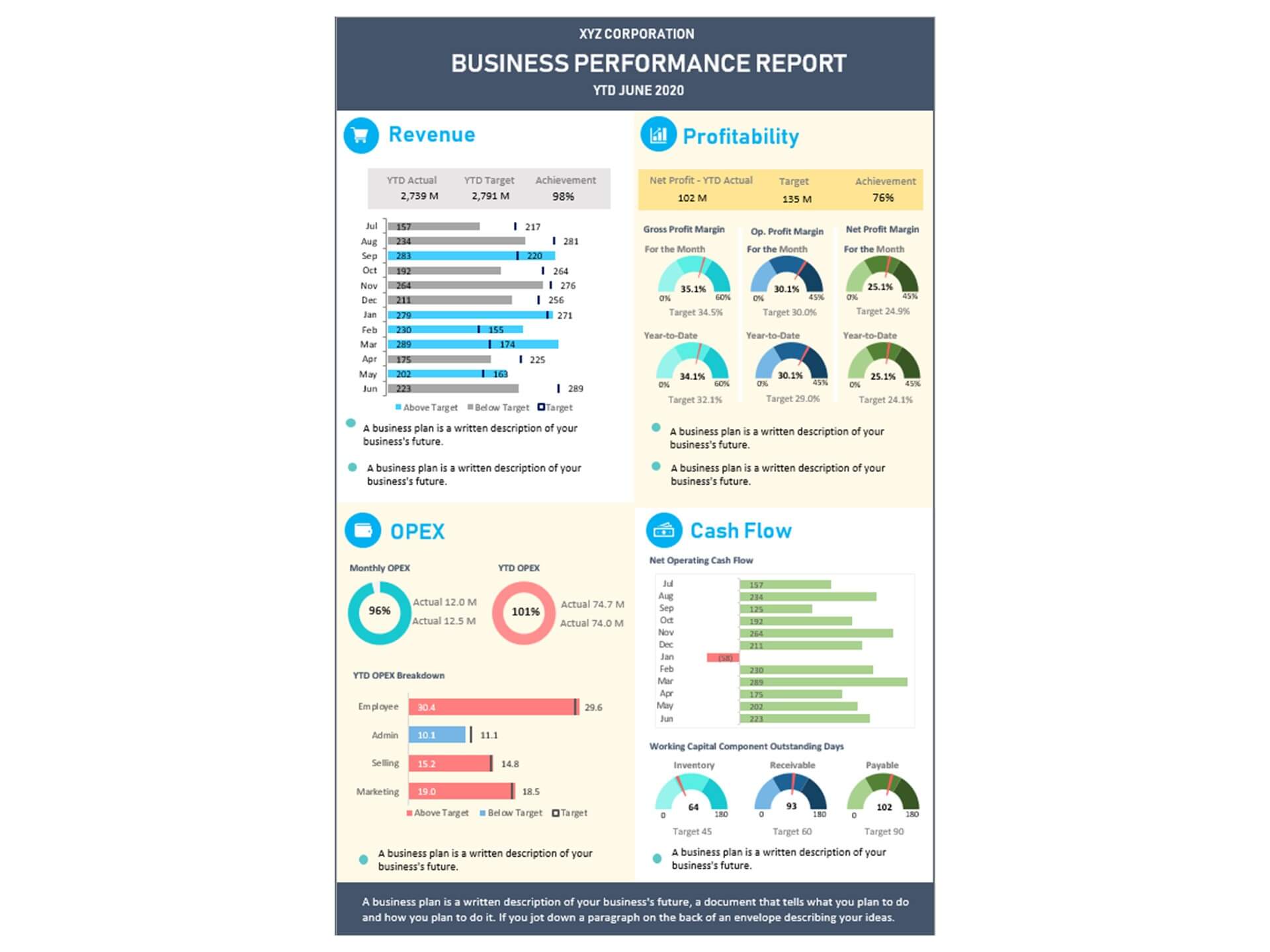
The following reference examples correspond directly to the requested template and reporting formats. They are presented in the same order as the target phrases and are intended to provide visual context for the types of spreadsheet, dashboard, document, and reporting resources discussed in this guide.
automated business report template excel
Source: Template.net
automated business report template free
Source: Bizinfograph
automated business report template google sheets
Source: SheetMetricz
automated business report template free download
Source: Rowspeak
automated business report template word
Source: Pexels
automated business report template excel free
Source: Etsy
business report template free
Source: Pexels
business report template pdf
Source: Pegadaian
example of a business report template
Source: Pexels
download template business report
Source: Pexels
excel business template report
Source: Pexels
Frequently Asked Questions
What is an automated business report template?
An automated business report template is a reusable reporting structure that combines standardized data inputs with formulas, calculations, charts, dashboards, or other automated processes so recurring reports can be refreshed instead of rebuilt manually.
Can an automated business report template be created in Excel?
Yes. Excel can support automated reporting through structured tables, formulas, pivot tables, Power Query, charts, conditional formatting, and other spreadsheet features. The appropriate level of automation depends on the size and complexity of the reporting process.
Can Google Sheets be used for automated business reporting?
Yes. Google Sheets can support collaborative reporting through formulas, structured tabs, dashboards, data validation, connected sources, and automation services. It is particularly useful when several people need browser-based access to the same reporting environment.
Is a free business report template suitable for professional use?
A free template can be suitable if its calculations, structure, licensing, compatibility, and data-handling approach meet the organization’s requirements. It should be tested and customized before being used for important business decisions.
What should an automated business report include?
A strong report usually includes an executive summary, defined KPIs, current results, relevant comparisons, trend information, significant variances, supporting analysis, risks or exceptions, and recommended actions. The exact structure should reflect the decisions the report supports.
What is the difference between a dashboard and a business report?
A dashboard is usually designed for fast monitoring and visual exploration, while a business report often provides more explanation, context, analysis, and recommendations. Many modern reporting systems combine both approaches.
How often should an automated business report be refreshed?
The appropriate frequency depends on the decision cycle. Some operational reports may need daily updates, while financial management reports may be reviewed weekly or monthly. The refresh schedule should match how quickly the underlying business conditions change.
How can reporting errors be reduced?
Use standardized source tables, controlled definitions, validation checks, documented formulas, reconciliation procedures, protected calculation areas, and a named reporting owner. Automated checks can identify missing, duplicate, or unexpected records before the report is distributed.
Should every business KPI be included in the dashboard?
No. A dashboard is more useful when it focuses on metrics connected to important decisions. Detailed supporting metrics can remain in secondary tables or worksheets so the primary dashboard stays focused.
Conclusion
An automated business report template can turn recurring reporting from a repetitive formatting exercise into a structured management process. The strongest systems separate source data, calculations, dashboards, commentary, and documentation while clearly defining each KPI and its intended use. Excel and Google Sheets can both support effective automation when their capabilities are matched to the business requirement. The most important goal is not to automate every possible action, but to create a reliable workflow in which new data refreshes consistent calculations, meaningful comparisons, useful visualizations, and decision-ready information. With thoughtful data structure, tested formulas, clear ownership, and an appropriately designed automated business report template, organizations can spend less time rebuilding reports and more time understanding what the numbers mean and deciding what to do next.
