The word “editable” is particularly important. Project conditions change constantly, so a useful dashboard should allow users to replace sample information, modify labels, adjust formulas, change charts, add project-specific fields, and adapt the layout to different audiences. A small marketing project may need task completion and campaign milestones, while a construction program may need budget variance, procurement status, site progress, change requests, and risk exposure. The underlying dashboard structure can remain consistent while the visible information changes.
Project dashboards are also available in several formats. Spreadsheet-based versions are practical for teams that already work in Excel or Google Sheets. Presentation dashboards work well for steering committees and executive reviews. Business intelligence platforms such as Power BI are useful when dashboards need interactive filtering, larger datasets, and more automated reporting. Online dashboards can provide a shared view for distributed teams, while PDF versions are useful when a fixed snapshot needs to be archived, printed, or included in a formal report.
Current template collections show that common dashboard components include task timelines, task-status charts, priority breakdowns, budget comparisons, pending actions, assignments, milestones, and risk information. These components are valuable because they answer different management questions: What is happening? What is late? What is costing more than planned? Who owns the work? What decisions are blocked? What risks need escalation? A dashboard becomes useful when those questions can be answered quickly without forcing stakeholders to interpret raw data.
This guide explains how to select, customize, build, and maintain an editable project dashboard. It covers spreadsheet, presentation, online, PDF, and business intelligence approaches, along with practical examples, data structures, dashboard design principles, common mistakes, and a repeatable implementation workflow. The goal is not to promote one software platform, but to help you create a dashboard that remains understandable and useful throughout the project lifecycle.
What Is an Editable Projects Dashboard Template?
An editable projects dashboard template is a pre-structured visual reporting framework designed to summarize project information while allowing users to modify the underlying data, calculations, labels, charts, and presentation. Unlike a static screenshot, an editable template is intended to become part of an ongoing workflow. Users enter or import project information, and the dashboard presents selected information in charts, tables, KPI cards, timelines, or other visual elements.
A dashboard template normally separates data entry from visual presentation. In a spreadsheet, this may mean one worksheet contains raw project data while another worksheet contains charts and summary metrics. In Power BI, the equivalent structure may involve data sources, a semantic model, measures, filters, and report pages. In PowerPoint, editable objects may include text boxes, charts, shapes, tables, and timeline elements. The implementation differs, but the underlying principle is the same: project information should be organized before it is presented.
The most useful dashboards are selective rather than exhaustive. A project may contain hundreds or thousands of individual records, but an executive dashboard does not need to display every record. Instead, it should surface indicators that help stakeholders understand project health. Detailed information can remain in supporting worksheets, source systems, or linked reports while the dashboard concentrates on the most decision-relevant information.
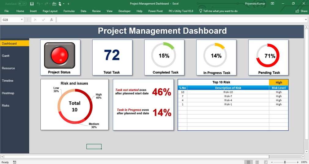
For example, a project dashboard might display overall completion, current phase, next milestone, planned budget, actual spending, overdue tasks, high-priority risks, open issues, and resource utilization. A project manager can then move from the high-level view into the detailed task list when a metric requires investigation. This layered approach keeps the dashboard readable without sacrificing analytical depth.
Templates also provide consistency. If every weekly project review uses the same status definitions, KPI locations, colors, and reporting periods, stakeholders learn where to look and how to interpret the information. Consistency reduces the cognitive effort required to compare one reporting period with another and makes project communication more predictable.
Why Use an Editable Project Dashboard?
The first major advantage is visibility. Project information is often distributed across schedules, budget files, task management systems, meeting notes, and risk registers. A dashboard provides a common summary layer that lets managers see the relationship between those areas. A schedule delay may become more serious when it coincides with high resource utilization or an approaching contractual milestone.
The second advantage is faster communication. A stakeholder who has only a few minutes may not have time to review a detailed project report. A dashboard can place the most important information near the top of the page, using clear labels and visual hierarchy. The purpose is not to eliminate detailed reporting, but to make the first level of understanding much faster.
The third advantage is customization. Different projects have different definitions of success. A software development project may emphasize sprint progress, defects, deployment readiness, and backlog health. A client implementation may focus on deliverables, approvals, training, adoption, and unresolved dependencies. An editable template allows the same basic dashboard concept to be adapted without rebuilding everything from scratch.
The fourth advantage is repeatability. Once the dashboard has been connected to a reliable data structure, the reporting process becomes easier to repeat. Instead of manually recreating charts each week, the team can update source data and refresh the dashboard. Automation may be simple, such as formulas and pivot tables, or more advanced, such as scheduled data refreshes in a business intelligence environment.
The fifth advantage is decision support. A dashboard should not simply describe what happened. It should make exceptions visible enough that managers can determine what action is required. For instance, a falling completion rate is more useful when accompanied by overdue tasks, owners, dependencies, and the next decision date.
Core Components of an Editable Projects Dashboard Template
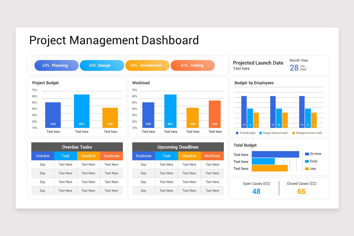
A strong dashboard starts with a small set of carefully selected components. The project header should normally identify the project name, reporting date, project manager or owner, current phase, and overall status. These fields establish context before the reader interprets any numbers or charts.
Progress indicators are another important component. Overall completion can be represented as a percentage, progress bar, gauge, or other simple visual. However, completion should be defined consistently. A project that is 70% complete by task count may not be 70% complete by value, effort, or weighted deliverables. The dashboard should explain or document the method used when the distinction matters.
Schedule information typically includes key milestones, planned and forecast dates, overdue tasks, and sometimes a Gantt-style timeline. The timeline should remain readable at the dashboard level. Detailed dependencies and task sequencing can be kept in a supporting schedule rather than forcing the dashboard to display every activity.
Financial information commonly includes approved budget, planned spending, actual cost, remaining budget, and variance. If earned value techniques are used, schedule and cost performance indicators can also be included. For less formal projects, a simple planned-versus-actual comparison may be sufficient.
Risk and issue information provides another essential layer. A dashboard may show the number of open risks by severity, unresolved issues, overdue actions, or risks requiring management attention. The important point is to show actionable exceptions rather than turning the dashboard into a complete risk register.

Project Status and Health
Overall project health should be easy to locate. A simple status such as On Track, At Risk, or Off Track can work when supported by objective criteria. For example, a team might define “At Risk” as a condition where an approved milestone is forecast to slip unless a corrective action is implemented.
Status definitions should not depend entirely on personal judgment. If one manager marks a project yellow whenever a task is late while another marks yellow only when a contractual milestone is threatened, comparisons become unreliable. A dashboard template is most valuable when the status logic is documented.
Health can also be divided into dimensions such as schedule, budget, scope, quality, resources, and risk. This creates a more informative view than a single overall color because it shows why a project is healthy or unhealthy.
A project could therefore be green for budget, yellow for schedule, green for scope, green for quality, yellow for resources, and red for risk. The overall project status would then require an explicit rule rather than an arbitrary choice.
For management meetings, health indicators should be accompanied by concise explanations. A red risk indicator without a description leaves stakeholders wondering what happened, who owns the response, and when the situation will be reviewed again.
Task and Milestone Tracking
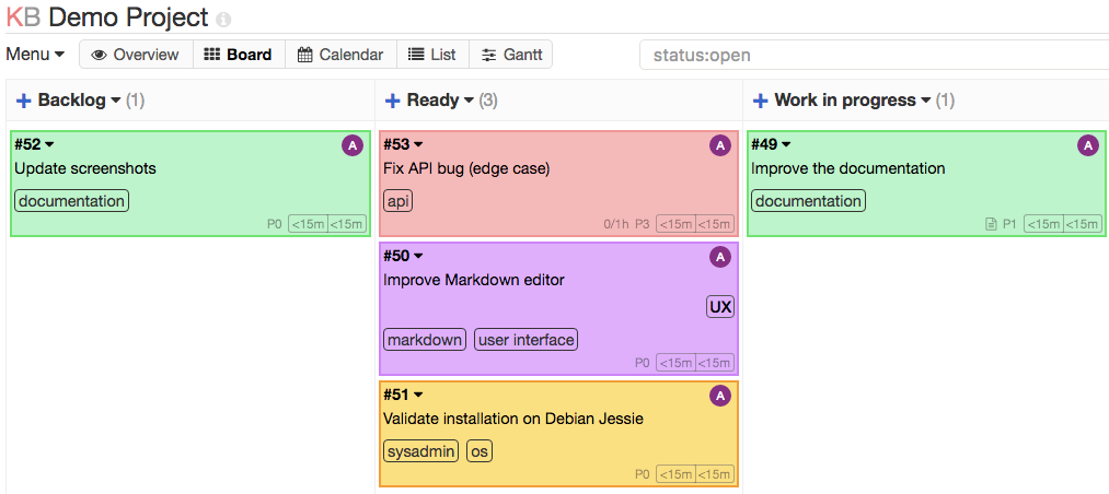
Task tracking is usually the operational foundation of a project dashboard. A practical task dataset may include task ID, task name, owner, priority, status, planned start, planned finish, forecast finish, percentage complete, and dependency information.
Milestones deserve separate treatment because they often represent outcomes rather than individual activities. A milestone might be approval of requirements, completion of testing, customer acceptance, regulatory submission, launch, or handover. A dashboard should make major milestones visible even when the underlying task list is large.
Status categories should be limited and clearly defined. Common categories include Not Started, In Progress, Complete, Blocked, and Overdue. Too many categories can make charts difficult to interpret and can encourage inconsistent data entry.
Priority is a different concept from status. A task can be high priority and complete, or low priority and overdue. Keeping these fields separate allows the dashboard to answer both “What is late?” and “What matters most?”
Owners should also be visible when operational action is expected. A dashboard that identifies ten overdue tasks without showing responsibility creates awareness without accountability. Adding ownership turns the information into something the team can act upon.

Budget and Cost Monitoring
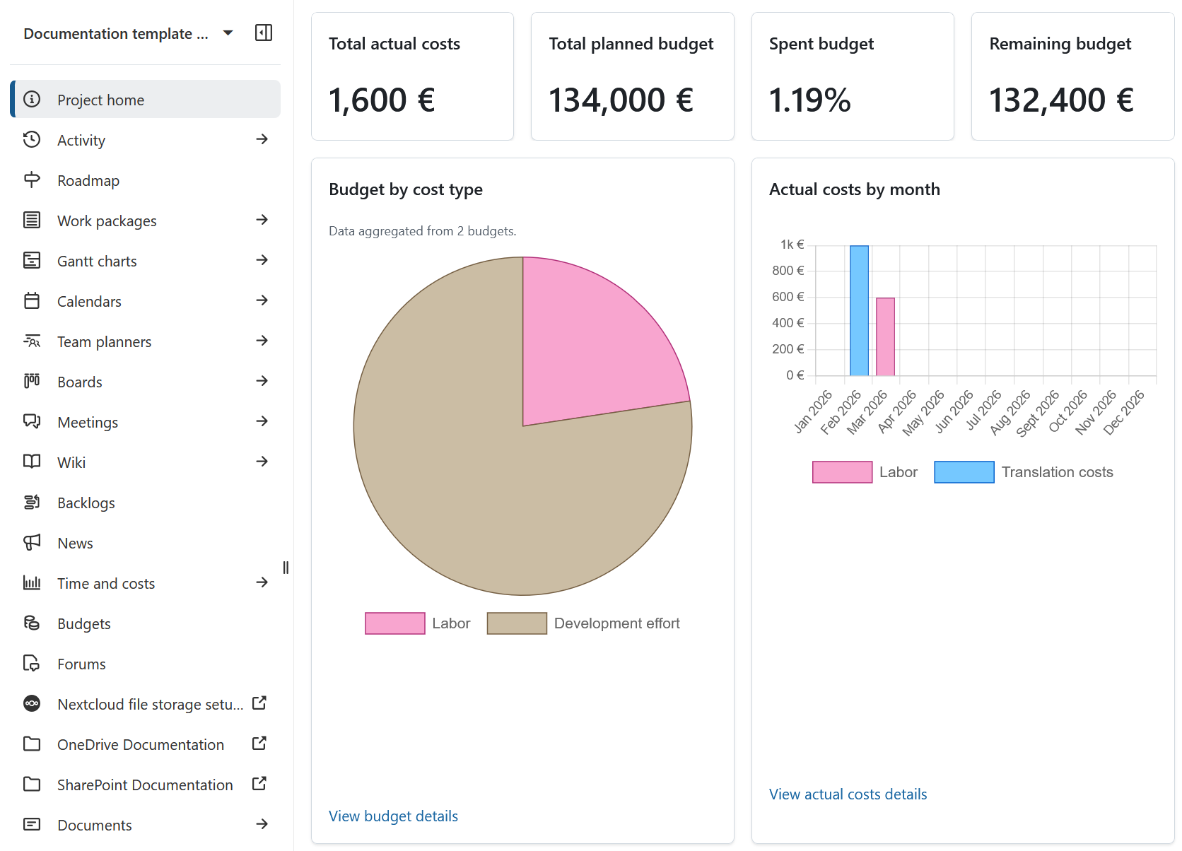
Budget reporting should distinguish between planned, committed, actual, and remaining amounts when those distinctions matter to the project. A simple dashboard might compare planned budget with actual cost. A more sophisticated dashboard can separate committed purchase orders, invoiced costs, forecast costs, and remaining contingency.
The most useful financial visualizations are usually comparative. A single “actual cost” number has limited meaning without context. Comparing actual spending with a baseline or planned curve makes it easier to see whether the project is consuming money faster or slower than expected.
Time should also be considered when interpreting cost. A project that has spent 70% of its budget while completing 40% of its work may deserve investigation, but the correct interpretation depends on the cost profile and project phase.
Budget charts should avoid unnecessary decoration. A clean bar chart comparing planned and actual values can be more useful than a complex visualization with many colors and labels.
Financial definitions should be documented in the underlying data model. Terms such as budget, actual, forecast, commitment, and variance can have different meanings between organizations, so the dashboard should not assume that every reader interprets them identically.
Resource and Workload Visibility
Resource information helps managers understand whether the team has enough capacity to deliver the planned work. Useful measures include assigned hours, available capacity, utilization, outstanding work, and workload by person or team.
A resource dashboard should avoid implying that high utilization is always positive. A team operating at maximum capacity may have little room to absorb unexpected work, defects, urgent requests, or schedule changes.
Resource views are particularly useful when several projects compete for the same specialists. A portfolio-level dashboard can reveal that a particular role is overloaded even when each individual project appears manageable in isolation.
Workload charts should be tied to the reporting period. A person assigned to ten hours of work next month should not necessarily appear overloaded today. Time boundaries help prevent misleading interpretations.
When possible, separate planned workload from actual effort. The difference between the two can reveal estimation problems, unexpected rework, or changes in scope.

Risk, Issue, and Dependency Tracking
Risk information should focus attention on uncertainty that could affect project objectives. Useful dashboard fields include risk description, probability, impact, owner, response strategy, target date, and current status.
Issues are different because they represent problems that have already occurred. Mixing risks and issues into one undifferentiated count can hide important distinctions. A project may have ten low-level risks but one unresolved issue that threatens a major milestone.
Dependencies are another valuable dashboard element. A project can appear healthy internally while being blocked by another team, supplier, approval authority, customer decision, or external system.
A useful exception panel might therefore contain the top three risks, the top three issues, and the most important dependencies. This is usually more actionable than showing every item in the underlying register.
Escalation rules should be clear. If a risk exceeds a defined impact level or an issue remains unresolved beyond a target period, the dashboard can flag it for management attention.

Choosing the Right Dashboard Format
There is no universally best dashboard format. The right choice depends on data volume, collaboration needs, audience, update frequency, automation requirements, and the skills of the people maintaining the dashboard.
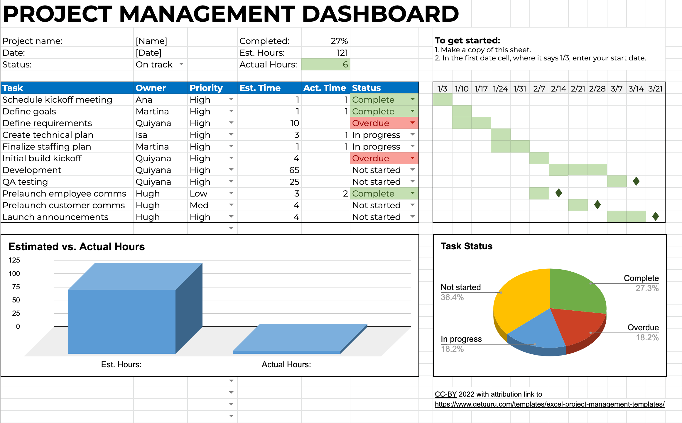
Excel remains a practical option when the project team needs formulas, tables, pivot tables, charts, and offline editing. It is especially suitable for small and medium-sized projects where the source data already lives in spreadsheets.
Google Sheets is attractive when multiple people need to edit the same workbook and the organization already works in Google Workspace. It is also convenient when users need browser-based access rather than locally stored files.
Power BI becomes more attractive when the dashboard must combine multiple data sources, provide interactive filtering, support a larger dataset, or serve a broader reporting environment. It can separate data preparation and modeling from the visual report itself.
PowerPoint is particularly effective for executive presentations. Its strength is not necessarily live operational tracking but communication. A project team can transform dashboard information into a concise status slide that fits naturally into a steering committee or board presentation.

Spreadsheet Dashboards
Spreadsheet dashboards should normally use a clean separation between input data, calculations, and presentation. This reduces the chance that someone will accidentally overwrite a formula while entering project information.
A useful workbook might contain an Input sheet, a Task Register, a Risk Register, a Dashboard sheet, and optional supporting tabs for budgets and resources. Small projects may need fewer tabs, while larger projects can benefit from more explicit separation.
Tables should use consistent headers and data types. Dates should be actual date values rather than text, percentages should use numeric percentage formats, and status values should come from controlled lists whenever possible.
Formulas should be visible and understandable to the people responsible for maintaining the workbook. Overly complicated formulas can create a dependency on one person and make troubleshooting difficult.
Before distributing the workbook, test it with blank rows, unusual dates, delayed tasks, completed tasks, missing owners, and zero-budget scenarios. Templates often fail not because the main scenario is wrong, but because edge cases were never tested.
Google Sheets Dashboards
Google Sheets dashboards work best when the workbook is designed for collaboration from the beginning. Instead of allowing everyone to edit every area, define which ranges are inputs and which areas are calculated or presentation-only.
Dropdowns can standardize project status, priority, owner names, and risk levels. This prevents variations such as “In progress,” “In Progress,” and “in-progress” from becoming separate categories in charts.
Charts should reference stable ranges or structured data where possible. If users frequently add new tasks, the dashboard should be designed so the chart source expands automatically or can be refreshed without manual rebuilding.
Permissions also matter. A shared dashboard can lose reliability when multiple users change formulas, delete rows, or overwrite historical information. Protecting calculation areas is therefore a practical control rather than merely a technical preference.
Google Sheets is also useful for lightweight online project reporting. Teams can share a read-only dashboard with stakeholders while maintaining a separate editable source workbook for project staff.
Power BI Dashboards
Power BI dashboards are best considered as a reporting layer over a structured data model. The visual report is only one part of the solution. The underlying tables, relationships, measures, filters, and refresh process determine whether the dashboard remains reliable.
A Power BI project dashboard can combine information from task systems, spreadsheets, financial systems, resource tools, and other approved sources. This can reduce manual consolidation when the data sources are consistent and accessible.
Interactive filtering is one of the main advantages. Stakeholders can filter by project, project manager, phase, department, status, or reporting period and then inspect the same dashboard from different perspectives.
However, interactivity should serve a purpose. Adding dozens of slicers can make the dashboard difficult to use. A better design provides a small number of meaningful filters and keeps the most important metrics visible without interaction.
Power BI dashboards should also include data-quality checks. If the source system contains missing dates, duplicate task IDs, inconsistent status values, or stale records, a visually polished report can still produce misleading results.
PowerPoint and PPT Dashboards
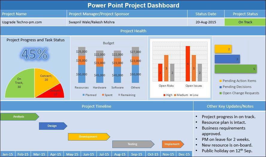
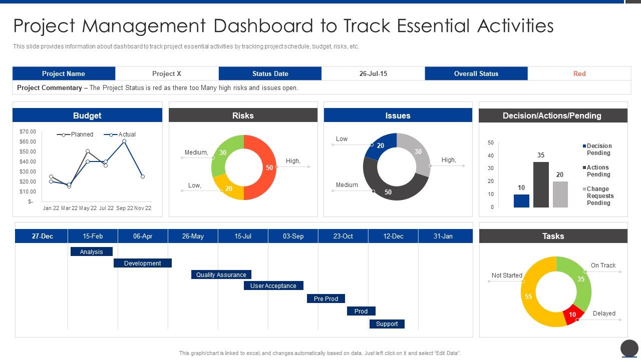
PowerPoint dashboards are useful when the main objective is communication rather than continuous operational monitoring. A presentation dashboard can combine status indicators, charts, timelines, risks, decisions, and management commentary into a single executive slide.
Editable PowerPoint objects allow teams to change labels, colors, dates, numbers, charts, and project-specific terminology. This flexibility is useful when the dashboard is part of a recurring executive reporting deck.
The main risk is manual maintenance. A PowerPoint slide may look current even when the underlying project data has changed. For this reason, teams should define a controlled process for updating presentation values from an authoritative source.
Charts linked to spreadsheet data can reduce manual work in some workflows. Even when a chart remains manually edited, the team should designate one source of truth and avoid creating conflicting numbers across multiple presentation slides.
Good presentation dashboards prioritize hierarchy. The most important status information belongs near the top, supporting detail follows, and narrative commentary should explain exceptions rather than repeat numbers already visible in the charts.
How to Build an Editable Projects Dashboard Template
The first step is to define the decisions the dashboard needs to support. Before choosing charts, write down the questions stakeholders ask during project reviews. These may include whether the project is on schedule, whether spending is controlled, which milestones are approaching, what is blocked, and which risks require action.
The second step is to define the reporting audience. Project teams need operational detail, project sponsors need health and exceptions, finance teams need financial accuracy, and executives usually need concise trends and decisions. One dashboard can sometimes serve multiple audiences, but separate views are often clearer.
The third step is to establish data sources. Identify where tasks, dates, budgets, costs, resources, risks, and milestones originate. If the same metric exists in several systems, designate an authoritative source before building formulas or charts.
The fourth step is to standardize definitions. Decide what “complete” means, how overdue work is calculated, how project health is determined, what counts as an open issue, and which budget fields are displayed.
The fifth step is to sketch the layout before building it. A simple wireframe can prevent overcrowding and helps ensure that every chart has a clear purpose. The dashboard should have a visual hierarchy rather than treating every metric as equally important.
Step-by-Step Dashboard Design Workflow
Start with a compact header containing project identification and reporting context. Include the project name, reporting date, current phase, project owner, and overall status. These fields should remain visually separated from analytical charts so the reader understands the context immediately.
Next, add the primary KPI row. A typical row may contain completion percentage, schedule health, budget variance, open issues, high risks, and the next major milestone. Select only the indicators that stakeholders genuinely use.
Then add the schedule view. A milestone strip, Gantt-style timeline, or due-date table can show upcoming work. The dashboard does not need to reproduce the full project schedule if that information is available elsewhere.
After schedule information, add financial and workload views. These help explain whether the project is progressing efficiently. Planned-versus-actual cost and assigned-versus-available workload are often more useful than isolated totals.
Finish the main dashboard with exceptions and actions. Include overdue tasks, high-impact risks, blocked dependencies, pending decisions, or management actions. The final section should help answer the question, “What needs attention now?”

Data Collection and Preparation
Dashboard quality depends on source-data quality. Before designing visualizations, inspect the data for missing fields, duplicate records, inconsistent categories, invalid dates, and conflicting ownership information.
Use a stable identifier for tasks and projects. Names can change, but an ID provides a reliable way to distinguish records. This becomes increasingly important when data is combined from multiple sources.
Standardize status values before building charts. A dashboard cannot reliably group records if the same status appears under multiple spellings. Controlled lists are especially useful in spreadsheet environments.
Review date logic carefully. A task should have a planned start and finish, while forecast dates should be distinguished from baseline dates when schedule variance matters. Avoid replacing historical baseline dates with current forecasts because doing so removes evidence of schedule movement.
Finally, decide how historical information will be stored. If the dashboard only displays the latest snapshot, it may not show trends. If trend analysis is important, retain dated snapshots or maintain a transactional history that allows the dashboard to compare reporting periods.

Practical Dashboard Example
Consider a hypothetical website redesign project. The dashboard reports 62% overall completion, a current execution phase, one approaching user-acceptance milestone, a budget that is slightly ahead of the planned spending curve, four open issues, and three high-priority risks.
The project manager could use the task register to identify that content migration is behind schedule while development is ahead. The dashboard would not need to show every task; instead, it could highlight the delayed work as an exception and identify the responsible owner.
The financial section could compare the planned budget with actual expenditure and forecast remaining cost. If spending is higher than expected, the dashboard should help the manager determine whether the difference is caused by accelerated work, scope changes, supplier costs, or estimation error.
The resource section could show that the design team has limited capacity during the testing period. This information might explain why one milestone is at risk even though most tasks remain on schedule.
The risk section could identify a dependency on customer approval. The practical management response might be to schedule a decision meeting, confirm the approval owner, and establish a date after which the project plan will need to be adjusted.

Using Dashboards for Different Project Types
Software projects often benefit from dashboards that emphasize sprint progress, backlog health, defect counts, release readiness, dependencies, and testing. A product team may also track feature progress and customer-impacting issues.
Construction projects typically require stronger financial, schedule, procurement, safety, change-order, and site-progress views. Milestones can include design approvals, procurement dates, inspections, installation stages, and handover activities.
Marketing projects may focus on campaign milestones, creative approvals, launch dates, content production, media spend, and deliverables. A dashboard can connect operational tasks with major campaign outcomes without turning into a general analytics report.
IT implementation projects may emphasize configuration, migration, testing, training, user acceptance, change requests, and go-live readiness. Dependency management is often particularly important because multiple systems and teams may need to coordinate.
Portfolio dashboards require another level of abstraction. Instead of displaying every task, they compare projects using common measures such as health, progress, budget variance, milestone status, risk exposure, and resource demand. This allows leadership to identify which projects need deeper review.
Dashboard Design Best Practices
Use visual hierarchy to guide attention. KPI cards should not compete with detailed tables, and every chart should have a clear purpose. The most important information should be easy to find without scrolling or filtering.
Use consistent colors for status categories. If green means healthy in one chart, it should not mean high priority in another. Color should reinforce meaning rather than create decoration.
Keep chart types simple. Bars, columns, lines, progress indicators, and compact tables are usually easier to interpret than highly decorative graphics. A dashboard should optimize comprehension rather than visual novelty.
Label metrics clearly. “Budget” may be ambiguous, while “Actual Cost vs Approved Budget” communicates much more. Similarly, “Progress” should indicate whether it represents tasks, effort, deliverables, or weighted completion.
Provide enough context to support action. A dashboard that reports “five overdue tasks” should ideally allow the reader to identify the tasks, owners, deadlines, and next action through a supporting table or drill-down view.
Common Mistakes to Avoid
One common mistake is putting too much information on one page. A dashboard is not a database dump. When every available metric is displayed, the reader has difficulty determining what matters.
Another mistake is using inconsistent definitions. If one reporting period calculates completion by task count and another calculates it by effort, the resulting trend may be misleading even if both percentages are mathematically correct.
Manual copying is another major risk. When numbers are transferred from several files into a presentation dashboard, transcription errors become more likely. Where possible, connect the dashboard to a controlled source or establish a documented update process.
Ignoring historical baselines is also problematic. A dashboard that only displays the current forecast may conceal how much the project has moved from its original plan. Retaining baseline information makes schedule and budget changes easier to understand.
Finally, avoid confusing visual polish with analytical quality. A dashboard can have attractive colors and sophisticated charts while still being based on incomplete, stale, or incorrectly classified data.

Practical Solution: Build a Dashboard That Teams Can Maintain
The most practical solution is to build the dashboard around a small, controlled data model rather than designing the visual page first. Start by creating tables for projects, tasks, milestones, risks, issues, resources, and financial values only where those entities are actually needed.
Next, define the minimum fields required for each table. For tasks, this might be Task ID, Project ID, Task Name, Owner, Status, Priority, Baseline Start, Baseline Finish, Forecast Finish, and Completion. For risks, it might be Risk ID, Description, Probability, Impact, Owner, Response, Due Date, and Status.
Then define dashboard rules before creating charts. For example, an overdue task can be defined as a task whose forecast finish date has passed while its status is not Complete. A high-priority risk can be defined using an agreed probability-impact threshold. These rules should be documented so users understand how the dashboard reaches its conclusions.
After the logic is established, create a one-page management view. Place context at the top, headline KPIs below it, schedule and financial information in the middle, and exceptions or actions toward the bottom. Keep detailed records in supporting sheets or linked systems.
Finally, establish a reporting routine. Assign ownership for updating source data, refreshing the dashboard, checking data quality, reviewing exceptions, and archiving historical snapshots. The dashboard becomes much more valuable when it is treated as part of the project operating rhythm rather than a document created only before a meeting.

Reference Examples
The following reference examples illustrate different dashboard formats and visual approaches. Each example is matched to the corresponding search phrase so readers can understand how the requested format may appear in practice.
editable projects dashboard template free
Source: PK: An Excel Expert
editable projects dashboard template excel
Source: Guru
editable projects dashboard template free download
Source: Etsy
editable projects dashboard template google sheets
Source: Etsy
editable projects dashboard template power bi
Source: Power BI project dashboard reference
editable projects dashboard template powerpoint
Source: ITSM Docs
editable projects dashboard template excel free
Source: SlideTeam
editable projects dashboard template ppt
Source: Nulivo Market
free editable dashboard template powerpoint
Source: Wikimedia Commons
free project dashboard template pdf
Source: Wikimedia Commons
free project dashboard template online
Source: Wikimedia Commons
project dashboard template free download
Source: Wikimedia Commons
Frequently Asked Questions
What should an editable projects dashboard template include?
A practical template should normally include project identification, overall health, completion, schedule or milestones, budget information, tasks, risks, issues, ownership, and important actions. The exact components should reflect the decisions the project team needs to make.
Is Excel a good format for a project dashboard?
Yes. Excel is particularly useful when project data already exists in spreadsheets and the team needs formulas, tables, charts, pivot tables, and flexible editing. It is often a strong choice for small and medium-sized projects.
Can a project dashboard work in Google Sheets?
Yes. Google Sheets can support collaborative project dashboards with shared editing, dropdowns, formulas, tables, and charts. The workbook should protect calculation areas and standardize input values to maintain data quality.
When should I use Power BI instead of Excel?
Power BI is worth considering when the dashboard must combine multiple sources, support interactive filtering, serve many users, or provide a more formal business intelligence environment. Excel can remain the better choice for simpler projects with manageable datasets.
Is PowerPoint suitable for project dashboards?
PowerPoint is highly suitable for executive reporting and presentation-oriented dashboards. It works especially well when stakeholders need a concise visual summary of progress, budget, risks, milestones, and decisions during a meeting.
What is the difference between a dashboard and a project status report?
A dashboard emphasizes visual monitoring and quick interpretation, while a status report often contains more narrative explanation and formal commentary. Many organizations use both: the dashboard provides the snapshot, while the report explains significant changes and actions.
How often should a project dashboard be updated?
The appropriate frequency depends on project speed and reporting needs. A rapidly changing operational project may require daily updates, while a stable project may only need a weekly or monthly management view. The important point is to use a consistent reporting cadence.
How can I make a dashboard easier to maintain?
Separate inputs from calculations, use standardized fields, protect formulas, document definitions, assign update ownership, and keep one authoritative source for important metrics. A simple dashboard that can be maintained reliably is usually more valuable than a complex dashboard that depends on manual corrections.
Should a project dashboard show every task?
No. The dashboard should show the tasks or exceptions necessary for management decisions. A detailed task register can remain in a supporting worksheet or project management system, while the dashboard highlights overdue, high-priority, blocked, or upcoming work.
How do I prevent misleading dashboard numbers?
Use consistent definitions, validate source data, retain baselines, document calculations, and check the dashboard against the underlying records. Data quality should be reviewed as part of the reporting process rather than only when an obvious error appears.
For a final implementation check, review whether the dashboard answers the project’s most important questions in a few seconds, whether each metric has a defined source and calculation, whether users can edit the appropriate fields safely, and whether exceptions lead to clear ownership and action. An effective editable projects dashboard template is ultimately less about having many charts and more about creating a dependable bridge between project data and project decisions.
