Modern sales teams often collect data from several places, including CRM systems, ecommerce platforms, accounting software, retail point-of-sale systems, spreadsheets, and manually maintained logs. Without a consistent reporting structure, each reporting period can become a fresh data-cleaning exercise. A strong template creates a stable framework so that the same metrics are calculated the same way, making comparisons across days, months, quarters, and years more trustworthy.
This guide explains how to design, use, and improve an advanced sales report template for practical business reporting. It covers the purpose of advanced sales reports, the data structure behind reliable dashboards, essential metrics, formulas, analysis methods, visual design, reporting frequency, examples, common mistakes, and a practical implementation workflow that can be adapted to Excel, Google Sheets, documents, PDF reports, or presentation formats.
What Is an Advanced Sales Report Template?
An advanced sales report template is a predefined structure for collecting, calculating, analyzing, and presenting sales information. Unlike a basic report that may show only total revenue and units sold, an advanced version connects several dimensions of performance. These can include sales by time period, product, category, customer, salesperson, region, channel, deal stage, target, margin, forecast, and prior-period comparison.
The word “advanced” does not necessarily mean complicated. A report can contain sophisticated analysis while remaining easy to read if its structure is intentional. The most useful design separates data entry from calculations and presentation. Raw records should have a clear home, calculations should be traceable, and the final dashboard or report should summarize results without requiring readers to search through thousands of transaction rows.
A reusable template also establishes definitions. For example, the business should decide whether “sales” means gross order value, invoiced revenue, net revenue after discounts, or closed-won contract value. It should define when a sale belongs to a reporting period and how returns, cancellations, taxes, currency conversions, and partial payments are handled. Consistent definitions are essential because attractive charts cannot compensate for inconsistent underlying numbers.
A typical advanced report contains a source-data area, reference tables, calculated fields, summary tables, visualizations, an executive summary, and an action section. Some organizations also add forecast calculations, exception alerts, pipeline coverage, customer concentration analysis, sales activity metrics, and narrative commentary. The exact components should reflect the decisions the report is expected to support rather than copying every feature from a generic dashboard.
For example, a hypothetical sales manager reviewing monthly performance may need answers to five questions: How much revenue was generated? How did actual results compare with target and the previous period? Which products, regions, channels, or representatives drove the change? What risks are visible in the pipeline? What actions should the team take before the next reporting cycle? A well-designed template places those answers within easy reach.
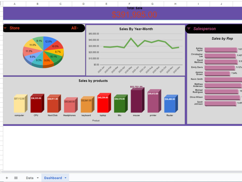
Why Businesses Need a Structured Sales Reporting Framework
Sales reporting becomes difficult when every manager builds reports independently. One person may compare current revenue with the previous month, another may compare against budget, and another may use a different revenue definition entirely. A structured framework reduces this inconsistency by documenting the required fields, metric logic, comparison periods, and presentation sequence before the reporting deadline arrives.
Standardization also improves speed. If the source table has stable columns and calculations are already connected to those fields, the reporting process can focus on validation and interpretation rather than repetitive reconstruction. The monthly routine becomes “load, refresh, check, analyze, and communicate” instead of “find files, merge columns, repair formulas, and hope the totals agree.”
Reliable templates support accountability because targets and actual results can be evaluated within the same structure. A manager can see the absolute variance, percentage variance, trend direction, and contributing segments. This makes it easier to distinguish a minor timing issue from a meaningful performance problem and prevents broad conclusions based only on a headline total.
A common mistake is treating reporting as an administrative output instead of a management tool. If the report is produced but nobody uses it to prioritize opportunities, adjust resources, investigate weak segments, or improve sales activity, the reporting process consumes effort without generating much value. An advanced template should therefore reserve space for observations, decisions, owners, and follow-up dates.
The framework should also be scalable. A small team might begin with a few hundred rows and one sales channel, while later expanding to multiple regions, product groups, currencies, and representatives. Designing clean field names, lookup tables, and calculation rules from the beginning makes future growth easier than repeatedly rebuilding the workbook or dashboard.
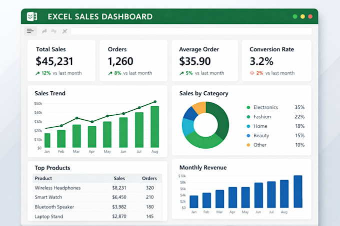
Start with the Decisions the Report Must Support
Before selecting charts or writing formulas, identify the decisions the report must support. A senior executive may need a concise view of growth, target attainment, major risks, and forecast direction. A sales manager may need rep-level performance, pipeline movement, conversion rates, and stalled opportunities. A retail manager may need store, product, transaction, discount, and margin analysis.
Each decision should lead to a reporting question. For example, “Should we increase inventory for this category?” requires product demand and profitability information. “Should we coach this sales representative?” may require activity, conversion, deal size, sales-cycle, and quota data. “Can we achieve the quarter target?” requires actual results, remaining target, open pipeline, probability assumptions, and expected close timing.
This approach prevents dashboard clutter. If a metric cannot influence a decision, it may not deserve prominent placement. It can remain available in supporting data, but the main report should prioritize information that changes action. The strongest reports are selective without hiding important evidence.
It is useful to create a short reporting brief before building the template. The brief can define the audience, reporting frequency, primary questions, approved metric definitions, data sources, comparison periods, required visuals, and expected actions. This document becomes especially valuable when several people prepare, review, or update the same reporting system.
For a hypothetical monthly report, the brief might require an executive KPI strip, actual-versus-target analysis, month-over-month comparison, product and region ranking, representative performance, pipeline outlook, notable exceptions, and three recommended actions. Those requirements are specific enough to guide design while leaving room to customize the layout.
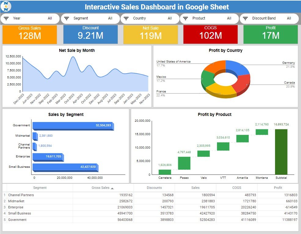
Build the Data Foundation Before Building the Dashboard
The quality of an advanced report depends on the quality of its source data. A dashboard should not be used to hide inconsistent records. Start by creating a source table with one clear row definition. Depending on the business, one row may represent a transaction, invoice, order, line item, opportunity, or closed deal. Mixing different row types in the same table makes aggregation unreliable.
Common fields include transaction or close date, order or deal identifier, customer identifier, product, category, salesperson, region, channel, quantity, gross sales, discount, net sales, cost, profit, target, stage, probability, and status. Not every report requires every field, but fields should have consistent names and data types.
Dates should be genuine date values rather than text labels such as “Jan-26” typed inconsistently. Amount fields should be numeric values rather than text containing currency symbols. Categories should use controlled labels so that “North,” “NORTH,” and “Northern Region” do not accidentally become separate groups in a summary.
Reference tables are useful for standardized mappings. A product table can connect product codes to categories, brands, costs, or strategic groups. A territory table can connect locations to regions. A target table can store monthly quota values. A calendar table can support month, quarter, year, fiscal period, and prior-period calculations.
Data validation should occur before reporting. Check for missing dates, duplicate transaction IDs, impossible quantities, negative amounts that require explanation, blank owners, invalid stages, and unexpected categories. A simple reconciliation between the report total and an independent source total can catch errors before they appear in management discussions.
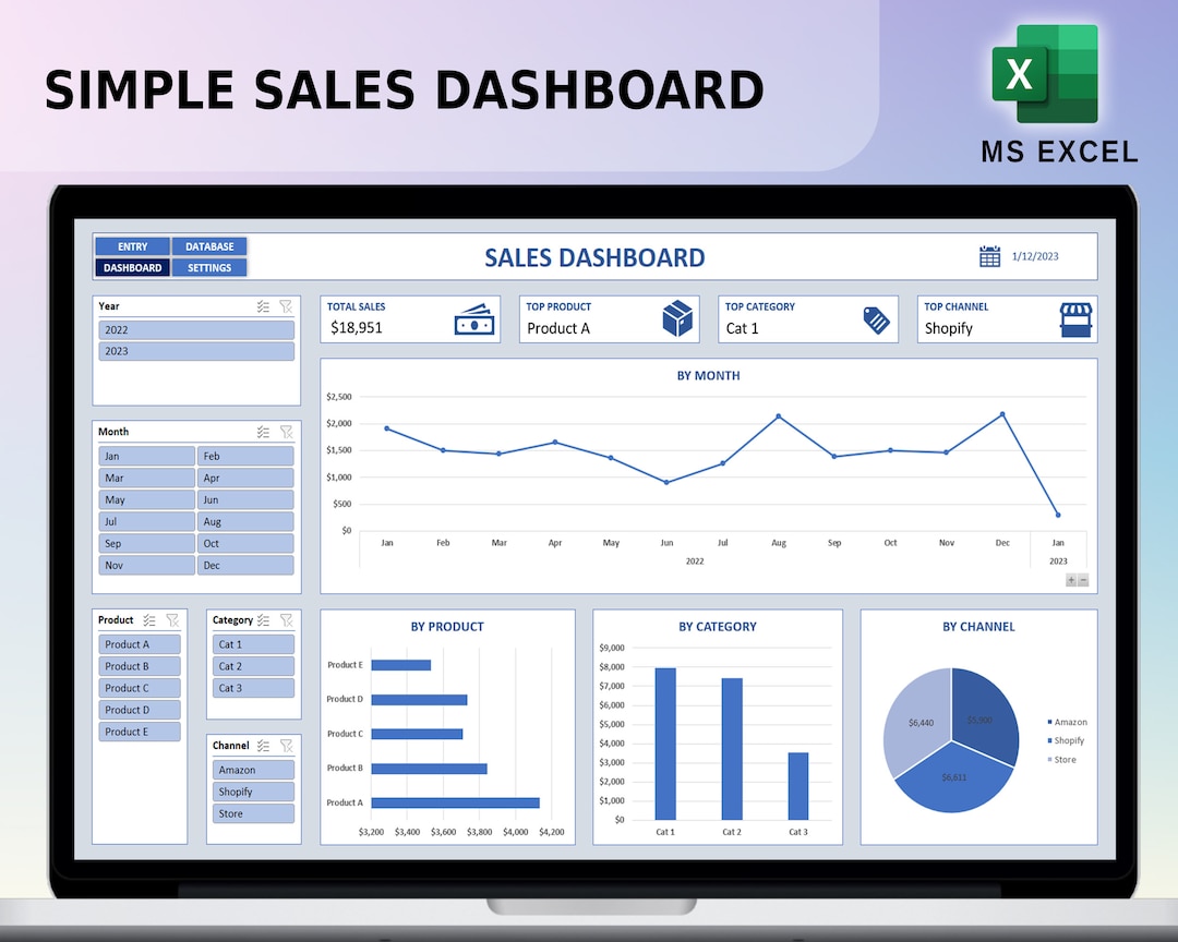
Design the Core Metric Layer
The metric layer is where raw fields become reusable business measures. Instead of repeatedly calculating the same totals in different dashboard cells, define the logic once and reuse it. This reduces formula drift, where similar-looking calculations gradually begin using different filters or date conditions.
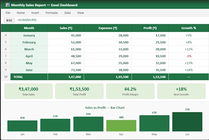
Total sales can be expressed as the sum of the approved revenue field for the selected period. Gross profit can be calculated as net sales minus directly assigned cost, provided the business uses that definition consistently. Gross margin percentage can be calculated as gross profit divided by net sales, with appropriate handling for zero or blank sales values.
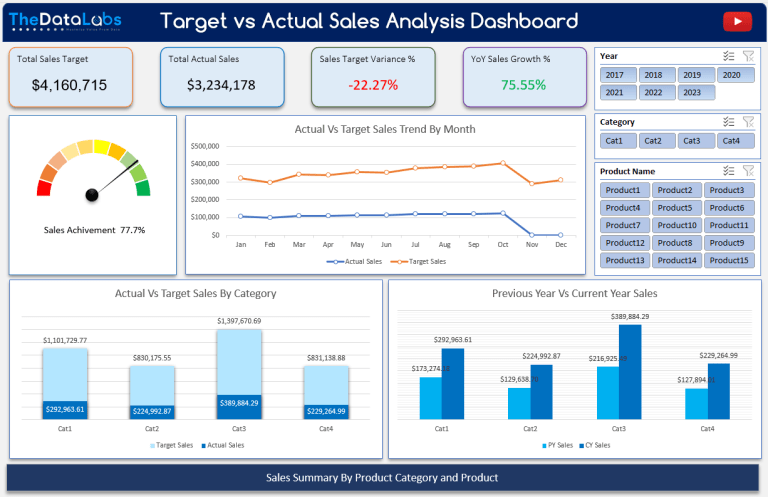
Target attainment is usually calculated as actual sales divided by target sales. Variance can be shown both as an amount and percentage because they answer different questions. A $10,000 shortfall may be significant for one team and negligible for another; the percentage comparison adds context, while the absolute value shows the size of the gap.
Growth calculations also require careful definitions. Month-over-month growth generally compares the current period with the immediately preceding comparable period. Year-over-year growth compares a period with the equivalent period one year earlier. If the prior value is zero, the report should avoid producing misleading infinite or error values and instead use an agreed exception rule.
Advanced reports often add weighted pipeline, average deal value, win rate, average sales cycle, pipeline coverage, customer retention, discount rate, return rate, and revenue concentration. These metrics should only be included when their inputs are reliable and when readers understand the calculation. More metrics do not automatically produce better analysis.
Choose KPIs That Explain Performance
A KPI is useful when it represents an important business objective and can be interpreted in context. Revenue is a common headline metric, but revenue alone may hide deteriorating margins, falling conversion, rising discounts, or a shrinking pipeline. An advanced sales report template should combine outcome metrics with selected drivers.
Outcome metrics describe results that have already occurred. Examples include revenue, units sold, gross profit, orders, new customers, and target attainment. Driver metrics describe activity or conditions that may influence future results, such as qualified opportunities, meetings completed, proposals sent, pipeline value, conversion rates, and average sales cycle.
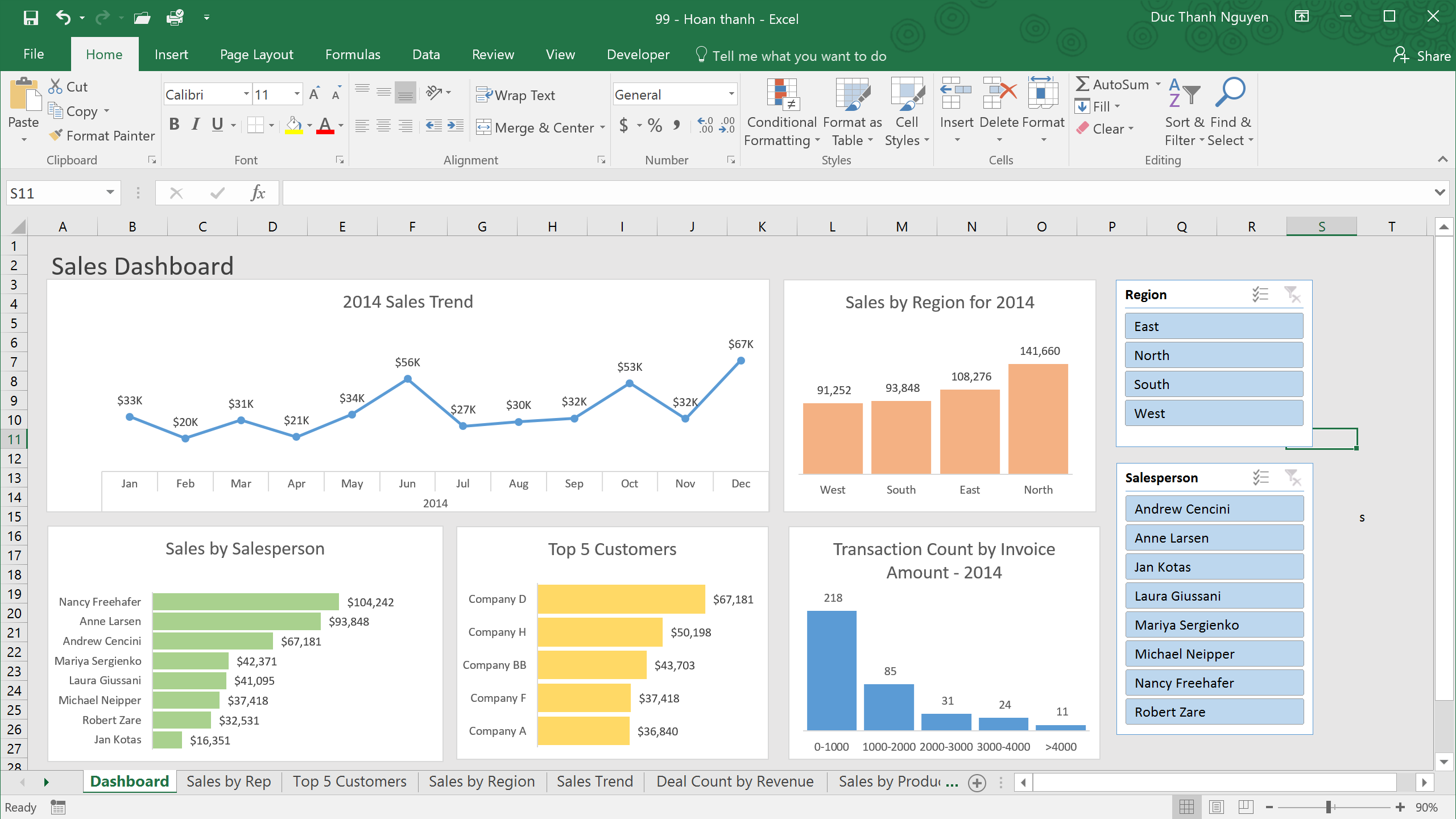
A balanced dashboard might use a small top row of KPIs rather than twenty competing cards. For a sales team, a practical combination could include current-period revenue, target attainment, growth versus the comparison period, win rate, average deal size, and weighted pipeline. A retail business may substitute transaction count, average order value, units per transaction, return rate, and gross margin.
Each KPI should answer a predictable question. A current value answers “Where are we now?” A target comparison answers “Are we on plan?” A prior-period comparison answers “Is performance improving or weakening?” A trend indicator answers “Is the movement persistent?” Together, these views are usually more informative than a single isolated total.
Targets should also be realistic and maintained separately from actual data. Hard-coding targets into formulas creates maintenance problems when quotas change. A target table with fields for period, team, salesperson, region, or product makes the reporting model easier to audit and update.
Use Time Analysis to Reveal Momentum
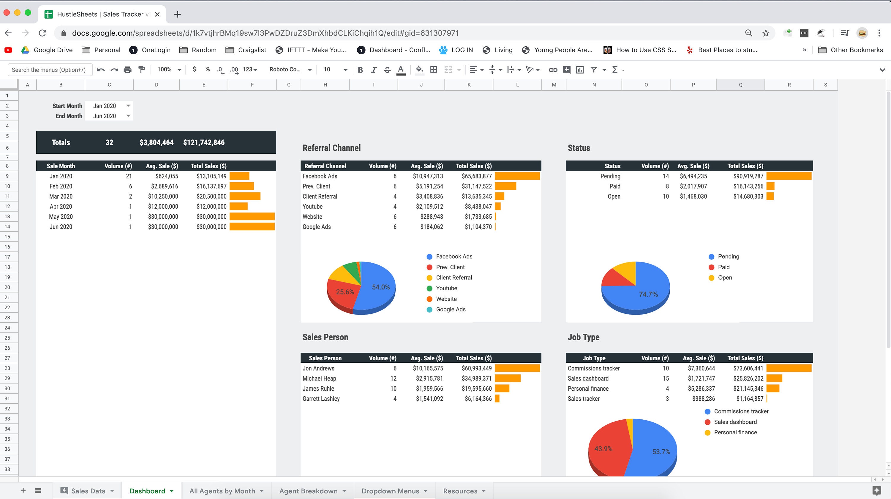
Time is one of the most important dimensions in sales reporting because performance is rarely static. Monthly totals can show direction, but daily or weekly data may reveal seasonality, campaign effects, stock issues, or unusual spikes caused by a single large order. The reporting level should match the business rhythm.
Trend analysis should compare like with like. A partial month should not normally be compared directly with a completed month without clear labeling. Seasonal businesses should avoid assuming that every month is comparable to the previous month. Year-over-year comparisons can be more useful when the business has strong recurring seasonal patterns.
Cumulative analysis is helpful for target tracking. A report can compare cumulative actual sales through the current date with cumulative target for the same point. This prevents a temporary timing difference from being misinterpreted as a permanent shortfall when the target itself is unevenly distributed throughout the year.
Rolling averages can smooth volatile daily results, but they should not replace the underlying numbers. A seven-day or four-week average can make direction easier to see while the actual values remain available for investigation. Label the calculation period clearly so readers know what the line represents.
Forecasting should distinguish actual history from future estimates. A simple projection may use historical averages or trends, while a sales forecast may use weighted pipeline and expected close dates. Regardless of the method, the assumptions should be visible so readers understand that a forecast is an estimate rather than booked revenue.
Analyze Sales by Product and Category
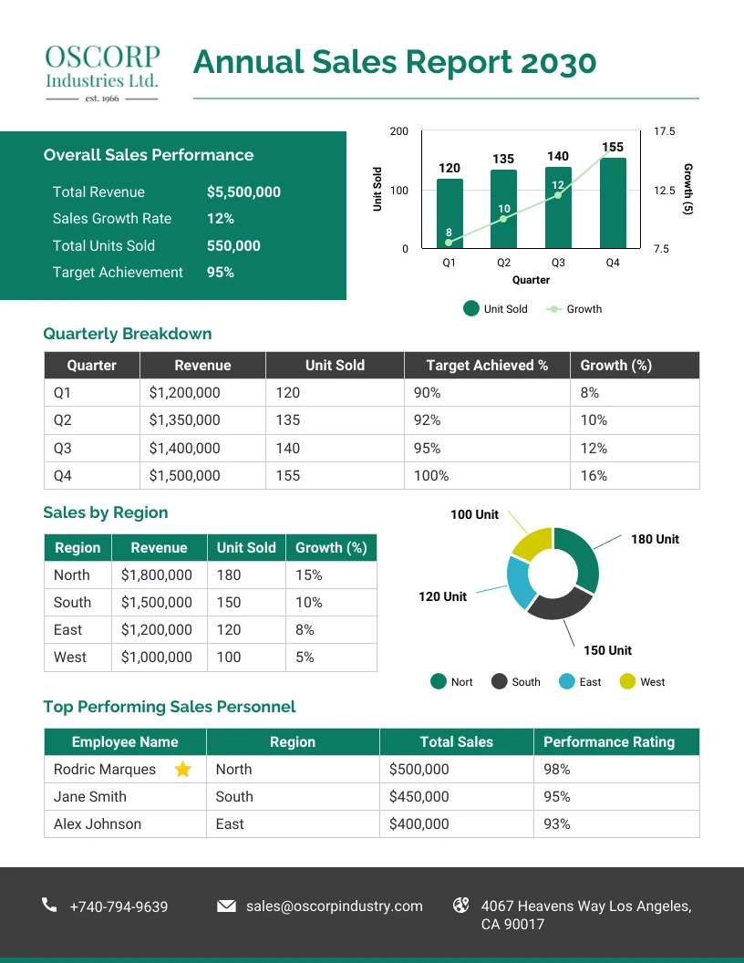
Product analysis helps answer whether growth is broad-based or dependent on a small number of items. A report should usually show both contribution and movement. A product may have high total revenue because of a large existing base but still be declining, while a smaller product may be growing quickly from a low starting point.
Ranking products by revenue is useful, but profitability may change the interpretation. A high-volume item with deep discounts or high costs may contribute less profit than a lower-revenue product. When reliable cost data exists, adding gross profit or margin analysis can improve decisions about promotions, inventory, and sales emphasis.
Category analysis can reduce excessive detail. Instead of presenting hundreds of product rows on the executive page, group products into meaningful categories and allow deeper analysis elsewhere. Categories should reflect how the business makes decisions, such as product family, strategic segment, price tier, or customer need.
Product performance should also be viewed across time. A simple table containing current-period sales, prior-period sales, variance, growth percentage, units, margin, and target can reveal products that are improving, weakening, or missing plan. Charts should support this analysis rather than duplicate every table value.
For example, a hypothetical report may show that Category A produced the highest revenue but declined 8% from the previous comparable period, while Category B grew 18% and improved margin. The management question is not simply which category is largest. It is whether the decline in the largest category requires action and whether the growth category can be scaled sustainably.
Analyze Sales by Region, Channel, and Customer
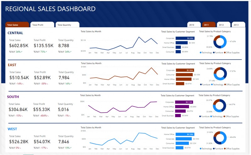
Regional reporting is useful when territories differ in market size, customer mix, staffing, pricing, or seasonality. Total regional revenue should therefore be accompanied by a relevant benchmark such as target, prior period, growth rate, margin, or productivity. Otherwise, a large territory may appear successful simply because it starts with a larger base.
Channel analysis helps determine where revenue originates and how efficiently each route to market performs. Common channels include direct sales, ecommerce, marketplaces, retail stores, distributors, partners, referrals, and inbound leads. The exact categories should match the organization’s operating model and remain stable enough for meaningful comparison.
Customer analysis can reveal concentration risk. If a small number of accounts generate a large share of revenue, the business may be exposed if one relationship changes. A report can identify top customers, share of total revenue, period-over-period movement, average order value, and new versus returning customer contribution.
Segment analysis is most useful when the segments support action. Dividing customers by arbitrary labels may add complexity without insight. Segments based on industry, account size, geography, lifecycle stage, customer type, or purchasing behavior are more valuable when those differences influence pricing, service, sales strategy, or resource allocation.
An advanced report can combine dimensions to investigate specific changes. If total sales fall, the next question may be whether the decline is concentrated in one region, channel, customer group, or product category. This drill-down logic turns reporting from passive measurement into structured diagnosis.
Measure Salesperson and Team Performance Fairly
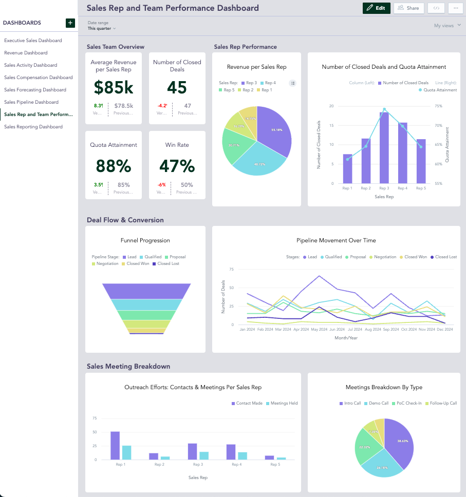
Salesperson reporting should recognize differences in territory, quota, deal type, lead quality, product mix, and sales-cycle length. Ranking representatives only by raw revenue can be misleading when assignments are materially different. Where possible, combine actual revenue with target attainment and additional indicators that reflect the role.
Useful performance measures may include revenue, quota attainment, deals won, win rate, average deal value, pipeline created, qualified opportunities, activity completion, and sales-cycle duration. Not every representative should be measured with every metric. The report should reflect the responsibilities the organization actually expects each role to perform.
Trend views are especially important for coaching. A single weak month may result from timing, while several declining periods may indicate a broader issue. Similarly, a representative with lower current revenue may have strong pipeline creation and an improving conversion rate, suggesting a different management response than a representative with weak results across every stage.
Rankings should encourage investigation rather than simplistic judgment. The report can flag notable differences, but managers should examine underlying data before concluding that a performance issue is caused by effort or skill. Missing data, territory changes, reassigned accounts, and unusually large deals can all affect results.
For a practical template, use one summary table that allows readers to compare team members and a separate detail area for selected representatives. This keeps the executive report concise while still supporting coaching conversations and deeper performance review.
Include Pipeline Health and Forecast Analysis
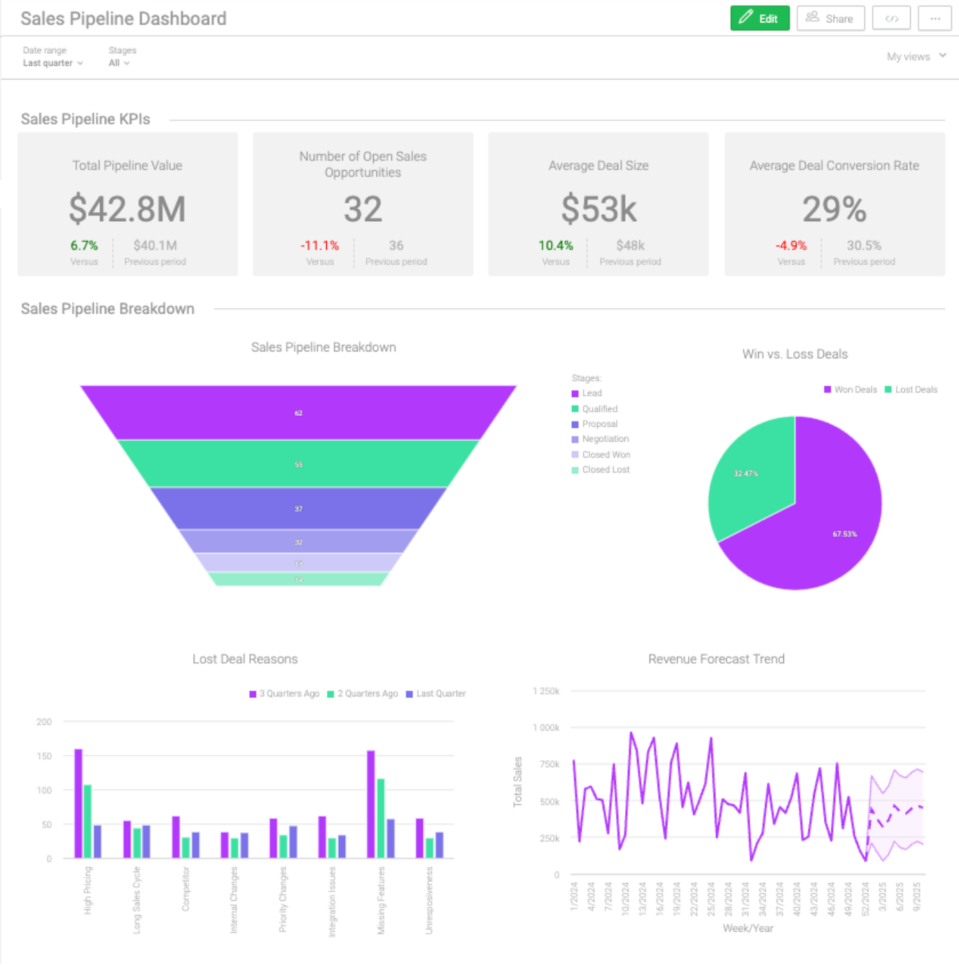
Historical revenue explains what has already closed, but pipeline analysis provides visibility into potential future performance. A report can summarize open opportunities by stage, expected close period, owner, amount, probability, age, and risk status. The purpose is to assess whether enough credible opportunity exists to support future targets.
Weighted pipeline is commonly calculated by multiplying an opportunity amount by an agreed probability. For example, a hypothetical $50,000 opportunity with a 40% probability contributes $20,000 to a simple weighted forecast. The probability should be based on a consistent model, not adjusted casually to make a forecast look more favorable.
Pipeline coverage compares available pipeline with a future target. The desired coverage ratio depends on historical conversion rates and the reliability of opportunity values. A high pipeline total is not automatically reassuring if most opportunities are early stage, old, poorly qualified, or expected to close after the reporting period.
Age analysis can identify stalled deals. Calculate how long an opportunity has remained in the pipeline or at its current stage, then compare it with normal cycle length. Old opportunities may require intervention, revised close dates, or removal from the forecast if they are no longer realistic.
A forecast section should clearly separate committed revenue, weighted pipeline, and unweighted opportunity value. Combining these categories without labels can create false confidence. A useful report states what is booked, what is probable, what remains uncertain, and what actions could improve the outlook.

Use Charts That Match the Question
Charts are valuable when they make a comparison, pattern, relationship, or exception easier to understand than a table. They are not automatically valuable simply because the template contains a dashboard. Before adding a visual, define the question it should answer.
Line charts are generally useful for time trends. Bar charts work well for comparing categories such as products, regions, or representatives. Stacked charts can show composition when the number of segments remains manageable. Tables are often better when readers need exact values or when many categories must be compared.
Target-versus-actual analysis can use side-by-side bars, variance columns, or a combination chart when the scale remains understandable. Avoid charts that use decorative effects, excessive colors, or unnecessary three-dimensional perspective because these can make accurate comparison more difficult.
Use consistent ordering and labeling. Months should appear chronologically, rankings should have an obvious sorting rule, and units should be clear. Currency, percentages, counts, and quantities should not be mixed on the same axis unless the design explicitly supports different scales.
A dashboard should also have visual hierarchy. Headline KPIs belong where readers naturally begin. Trend and comparison charts should support the KPI story. Detailed supporting tables can appear lower on the page or on separate tabs. The reader should understand the report flow without needing an instruction manual.
Separate Executive Summary from Operational Detail
Executives and frontline managers often need different levels of detail. An executive summary should focus on the most important outcomes, changes, risks, and decisions. It does not need to display every customer, transaction, or activity count.
A useful summary may begin with the reporting period and data status, followed by headline KPIs, target comparisons, major trend changes, top positive contributors, major negative contributors, forecast outlook, and recommended actions. The exact layout can vary, but the sequence should answer high-level questions quickly.
Operational tabs can contain more detail. A sales manager may need a representative table, opportunity aging list, product ranking, regional comparison, or customer drill-down. Separating these views prevents the main page from becoming crowded while preserving the evidence needed for follow-up.
Narrative commentary should be specific. Instead of writing “Sales were lower due to market conditions,” identify the visible drivers when supported by the data. For example: “The hypothetical monthly shortfall was concentrated in Region East and Product Group C, while other major segments remained near target.”
The best commentary also distinguishes observation from interpretation. An observation reports what the data shows. An interpretation proposes a reason. A recommendation identifies an action. Keeping these categories clear reduces the risk of presenting an assumption as if it were a proven fact.
How to Create the Template Step by Step
Start by defining the reporting period, audience, and decisions the report will support. Do not begin with colors or chart types. Write down the required outcomes and comparison periods first so the data model and calculations can be designed around real reporting needs.
Next, inventory the available data sources. Identify which source owns each field and how often it is updated. Record known limitations, such as delayed cost data, incomplete channel labels, or opportunities that are manually maintained. A transparent limitation is better than an apparently precise number built on unreliable data.
Create a clean source table and standardize field names. Add helper columns for year, month, quarter, reporting period, or other dimensions needed for summaries. Use separate reference tables for categories, targets, mappings, and controlled values instead of embedding changing assumptions throughout formulas.
Build the metric layer next. Calculate totals, variances, growth, margins, attainment, conversion, and forecast measures in a way that can be checked independently. Test several records and totals manually before connecting the calculations to the final dashboard.
Finally, create summary tables and visualizations from the validated metric layer. Add an executive narrative and action section only after the numbers are stable. Then test the full workflow using a new reporting period to ensure the template updates without manual redesign.
Useful Formula and Calculation Patterns
Formula design should favor transparency. A long formula may appear efficient but become difficult to audit when several business rules are embedded inside it. Where practical, use helper columns or named calculations that show intermediate logic, especially for date classifications, status flags, and complex segment rules.
Conditional aggregation is central to sales reporting. A report often needs totals based on multiple conditions, such as sales for a selected month and region, revenue for a selected representative, or closed-won value for a specific product category. The important principle is to ensure every condition refers to the same approved data definition.
Lookups are useful for enriching transactional data. A product code can retrieve category or cost information, while a territory code can retrieve region or manager information. Reference tables should be maintained carefully because an incorrect mapping can affect many summary calculations at once.
Error handling should be intentional. Blank values, missing targets, zero denominators, and incomplete historical periods can produce misleading outputs. A formula should return an understandable blank, status label, or approved alternative rather than displaying an unexplained error in a management report.
When possible, keep manual inputs visually and logically separate from calculated outputs. Users should know which cells are intended for editing and which cells are generated by the template. This reduces accidental overwriting and makes handoffs between team members easier.
How to Use Excel and Google Sheets Effectively
Spreadsheet-based reporting works best when the workbook or file has a clear architecture. A simple structure may include a raw data sheet, reference tables, calculations, summary tables, dashboard, and instructions. Users should not have to guess where new data belongs or which calculations are safe to edit.
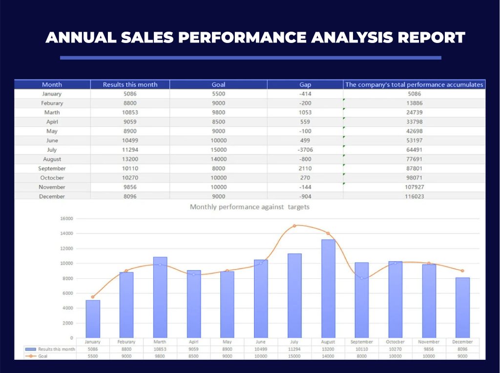
Excel is well suited to structured tables, PivotTables, PivotCharts, filtering, conditional formatting, and more advanced data transformation workflows. These tools can help summarize large datasets and support repeatable reporting when the source structure remains stable.
Google Sheets can be useful when multiple people need browser-based collaboration and shared access. Pivot tables, charts, filters, formulas, and collaborative editing can support a lightweight reporting system, provided the team establishes permissions and avoids uncontrolled changes to key formulas.
Whichever platform is used, the template should avoid fragile dependencies. Broken external links, hidden manual adjustments, undocumented macros, and formulas copied across inconsistent ranges make recurring reporting risky. Keep the refresh process understandable for the person who will actually maintain it.
Version control matters as well. Save a clean master template separately from completed reporting periods. If the reporting structure changes, document what changed and why. This helps future users understand whether a difference between two reports reflects business performance or a change in methodology.
Different Reporting Frequencies Require Different Emphasis
Daily sales reports are generally operational. They may focus on current sales, orders, transactions, returns, store or channel performance, activity levels, and immediate exceptions. The report should be fast to update because its value declines if it arrives after the operational window has passed.
Weekly reports often connect activity with outcomes. A sales team may review calls, meetings, proposals, pipeline movement, wins, losses, and revenue progress. The weekly rhythm is useful for identifying obstacles early enough to change behavior before the end of the month or quarter.
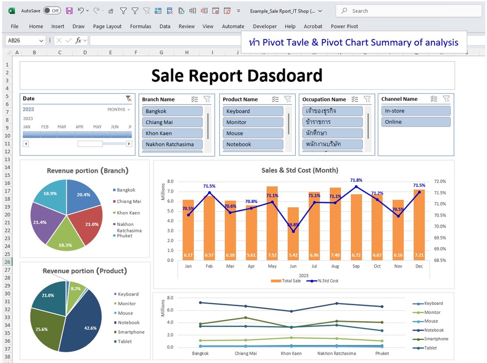
Monthly reports typically provide a fuller management view. They can compare actual results with target, previous month, and prior-year period; analyze products, regions, customers, and representatives; review pipeline; and document recommended actions. The monthly report often becomes a stable historical record.
Quarterly reports can place greater emphasis on strategic performance, trend direction, forecast quality, quota attainment, territory results, and major customer or product changes. Annual reports may include broader comparisons, recurring patterns, cumulative results, and planning implications for the following year.
The template should not merely duplicate the same dashboard for every frequency. Different time horizons answer different questions. A strong reporting system shares core definitions while changing the level of detail and analysis to suit the management cycle.
Common Mistakes That Reduce Report Quality
One common mistake is mixing raw data with presentation elements on the same sheet. When users insert new rows near charts, overwrite formulas, or manually change summary values, the report becomes fragile. Separate data storage from the reporting view whenever practical.
Another mistake is excessive metric volume. A dashboard packed with dozens of numbers may appear comprehensive while making important changes harder to find. Prioritize decision-relevant metrics and place secondary information in supporting views.
Inconsistent comparison periods are also dangerous. Comparing a completed month with a partial month, or current-quarter results with an unequal prior period, can produce misleading conclusions. Display the reporting dates clearly and ensure comparison logic is consistent.
Manual copying is a frequent source of errors. Repeatedly moving totals from one workbook to another increases the chance of selecting the wrong period or range. Where a recurring calculation can be automated through a controlled summary process, automation usually improves consistency.
Finally, do not confuse a polished layout with validated analysis. Before distributing the report, reconcile important totals, check filters, test selected segments, review unusual changes, and confirm that narrative conclusions are supported by the visible evidence.
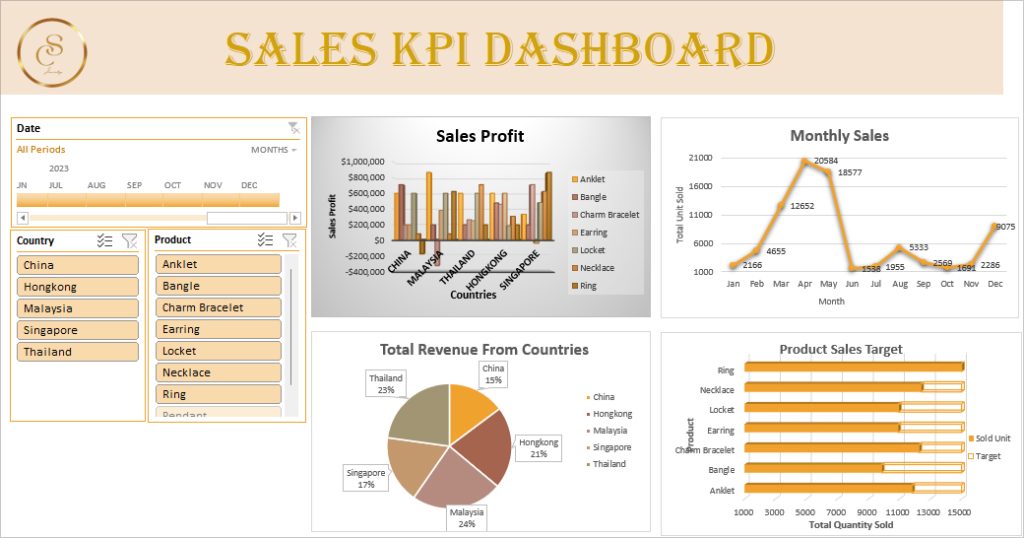
Best Practices for Professional Sales Reporting
Use a consistent reporting calendar. Define when source data is considered final, when validation occurs, who reviews exceptions, and when the completed report is distributed. A predictable timetable reduces last-minute changes and gives stakeholders confidence that periods are comparable.
Document metric definitions in a compact data dictionary. For each important metric, record the name, purpose, formula concept, source fields, exclusions, and owner. This is especially useful when finance, sales, operations, and analytics teams use the same report.
Show data freshness. A small report header can state the reporting period and the date or time through which the source data was refreshed. This prevents readers from assuming that a dashboard represents live performance when it actually reflects a completed extract.
Use exception-based review. Rather than manually reading every value, define thresholds that flag unusually large variances, missing targets, sharp declines, or old opportunities. Exceptions should trigger investigation, not automatic conclusions, but they can make review faster.
Maintain a feedback loop. After each reporting cycle, ask whether readers used the report and which decisions it supported. Remove low-value sections, improve unclear metrics, and add analysis only when it addresses a recurring business need. Templates should evolve with the reporting process rather than becoming permanent collections of unused charts.
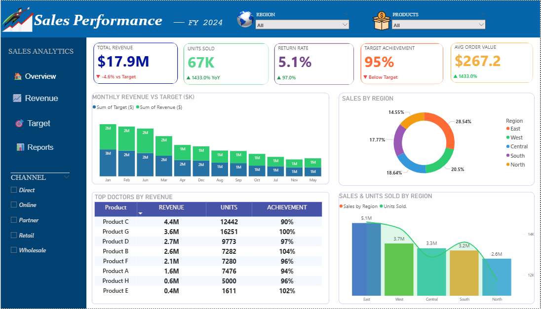
Practical Example of an Advanced Monthly Sales Report
Consider a hypothetical company with three regions, five product categories, ten sales representatives, and several sales channels. The monthly report begins with total net revenue, gross profit, target attainment, month-over-month growth, win rate, and weighted pipeline.
The next section compares actual revenue with target by region. The report then ranks product categories by revenue and growth, showing whether performance is concentrated or broadly distributed. A representative table displays revenue, quota attainment, wins, average deal size, and pipeline coverage.
The pipeline section separates opportunities expected to close during the next reporting period from later opportunities. It highlights deals that have remained in a stage longer than the normal cycle and identifies a hypothetical target gap that cannot be closed using currently committed revenue alone.
The narrative might state that total revenue reached 96% of target, with strong performance in two regions offset by weakness in one region. It might note that a specific product category drove much of the decline and that the weighted pipeline suggests a potential recovery if a defined group of qualified opportunities progresses on schedule.
The action section then converts analysis into ownership: review the declining category with product and sales leaders, validate several high-value opportunities before including them in the forecast, and assign regional managers to address identified pipeline bottlenecks. This is what turns a report from a record of results into a management instrument.
Practical Solution
The most practical way to implement an advanced sales report template is to begin with a minimum viable reporting model and expand only after the core process works reliably. Start with one approved raw data table, one target table, one calculation layer, and one executive summary. Avoid beginning with dozens of charts or complex automation.
Step one is to define the row structure and required source fields. Step two is to standardize categories, dates, owners, and revenue definitions. Step three is to validate a sample period manually. Step four is to build repeatable summaries for total sales, target attainment, growth, product performance, regional performance, representative performance, and pipeline.
Step five is to create the dashboard around a reporting sequence: current results, comparison, drivers, forecast, risks, and actions. Step six is to test the template with at least one additional period. If the report requires formula repair or layout reconstruction during the test, fix the model before adopting it as the recurring standard.
For ongoing use, establish a simple monthly workflow: load or refresh source data, run validation checks, confirm headline totals, refresh summaries, review exceptions, write evidence-based commentary, assign actions, and archive the completed period. Keep a master version of the template separate from the historical report copies.
As the business grows, add complexity carefully. Introduce more dimensions, automation, forecasting methods, or business intelligence tools only when the reporting need justifies them. The strongest advanced sales report template is not the one with the most features; it is the one that consistently produces accurate, understandable, and actionable information with a process the team can maintain.
Reference Examples
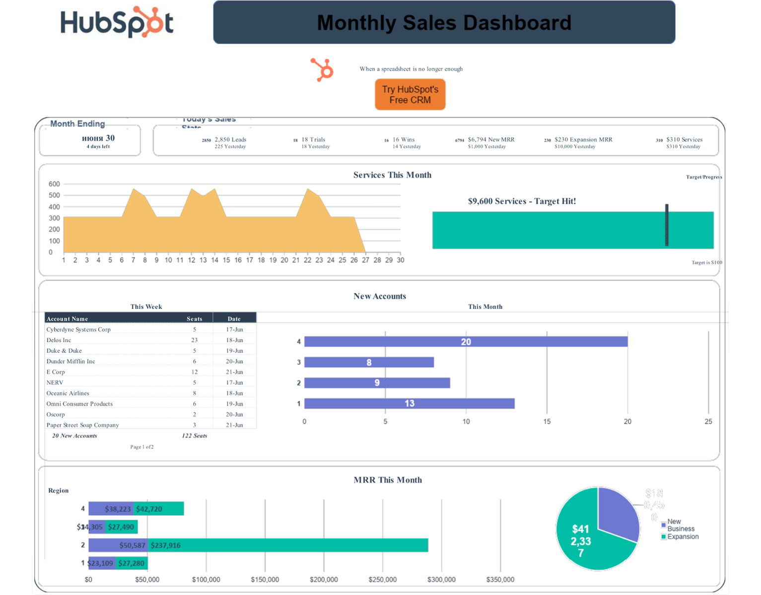
The following examples illustrate report and dashboard formats associated with the requested keyword variations. Each item is presented with one dedicated visual reference and its identified source.
advanced sales report template excel
Source: HubSpot
advanced sales report template free download
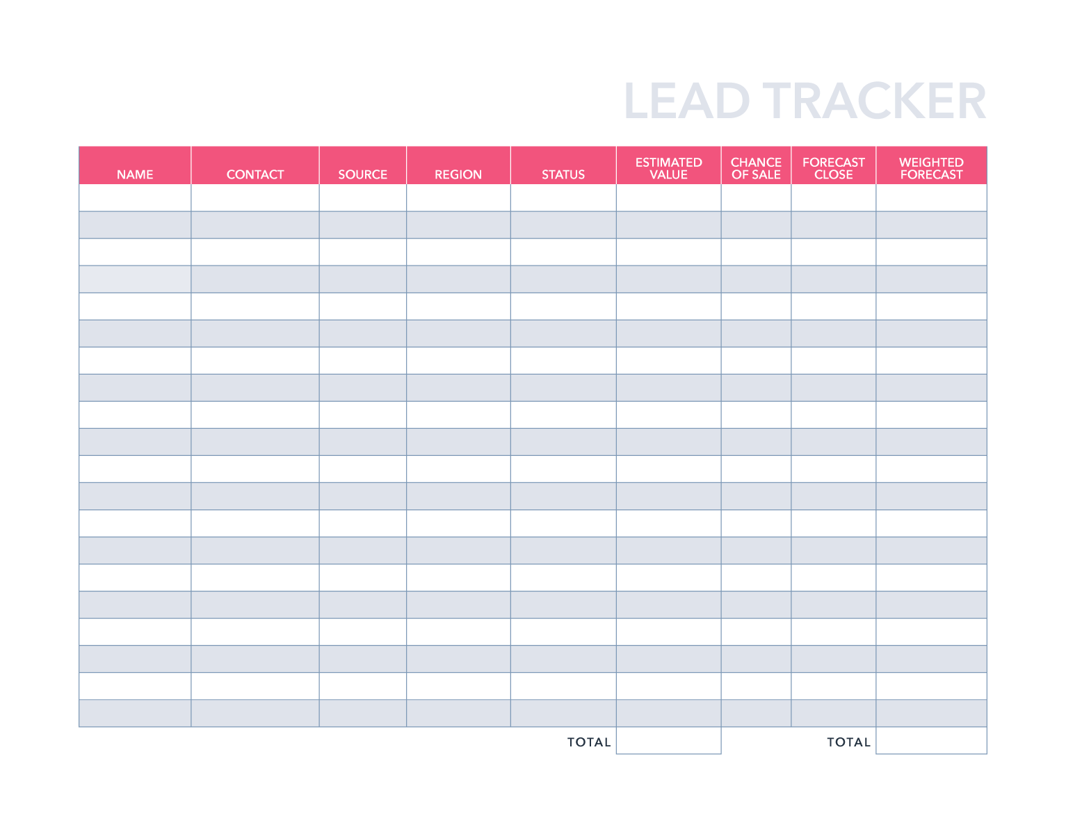
Source: HubSpot
advanced sales report template google sheets
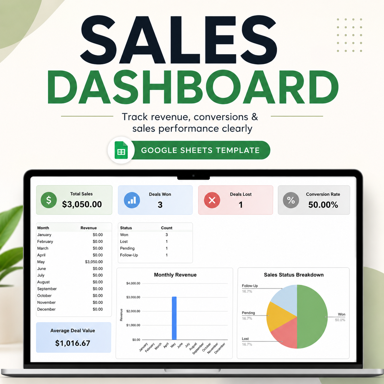
Source: Payhip
advanced sales report template free

Source: Template.net
advanced sales report template pdf
Source: HubSpot
advanced sales report template word

Source: Canva
advanced sales report template powerpoint
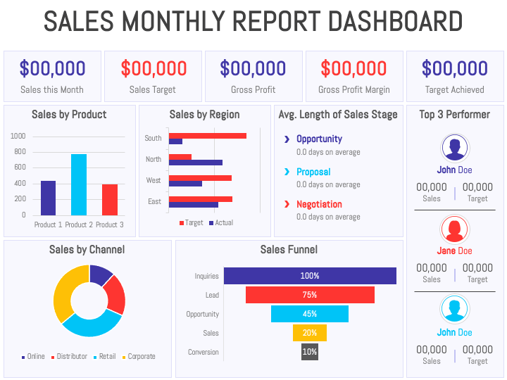
Source: SketchBubble
advanced sales report template excel free

Source: Growth Business Templates
advanced excel sales report
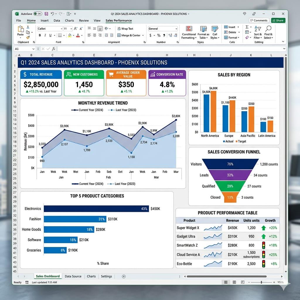
Source: Etsy
template for sales report
Source: Gumroad
annual sales report template
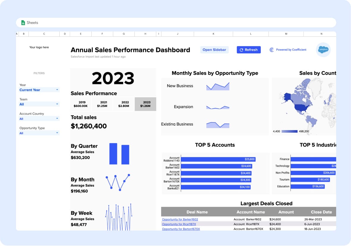
Source: Coefficient
advance retail sales report

Source: LinkedIn
Frequently Asked Questions
What should an advanced sales report template include?
It should include a clean data foundation, approved metric definitions, headline KPIs, target and prior-period comparisons, relevant segmentation, trend analysis, and an action-oriented summary. Additional features such as pipeline, forecasting, margin, and activity analysis should be included when they support real business decisions.
How many KPIs should appear on the main dashboard?
There is no universal number, but the main dashboard should show only the metrics needed for rapid interpretation. A compact group of carefully selected KPIs is usually easier to use than a large collection of competing cards.
Should sales reports use actual sales or gross sales?
The correct choice depends on the reporting purpose and business definition. The important requirement is consistency. Clearly define whether the report uses gross sales, net sales, invoiced revenue, recognized revenue, or another approved measure, and apply that definition consistently.
How often should a sales report be updated?
The reporting frequency should match the management cycle. Daily reports support operations, weekly reports support activity and pipeline management, monthly reports support broader performance analysis, and quarterly or annual reports support longer-term evaluation and planning.
Can one template work for multiple sales teams?
Yes, if the underlying data structure is standardized and the template uses dimensions such as team, region, representative, product, or channel. Different teams may still need separate dashboard views because the most useful operational metrics can vary by role.
What is the difference between a sales dashboard and a sales report?
A dashboard usually emphasizes current visual monitoring and rapid filtering, while a report may include a defined reporting period, narrative analysis, conclusions, comparisons, and recommendations. An advanced reporting system can use both: the dashboard for rapid visibility and the report for documented interpretation and action.
How can I make a sales report easier to audit?
Separate raw data, calculations, and presentation; document metric definitions; avoid hidden manual adjustments; use stable reference tables; reconcile important totals; and preserve the reporting period and data refresh status. Auditability improves trust and makes errors easier to investigate.
What is the most important design principle for an advanced sales report template?
Design the report around decisions rather than around available data. Every major section should help readers understand performance, identify meaningful changes, evaluate risks or opportunities, or decide what action to take next.
Conclusion
An effective advanced sales report template creates a bridge between raw sales data and practical business action. Build it on clean data, consistent definitions, reusable calculations, meaningful comparisons, and visuals that answer specific questions. Keep the executive view focused, preserve detailed evidence for investigation, validate results before distribution, and include clear actions alongside the analysis. When the reporting process is repeatable and the metrics are trusted, the template becomes more than a document: it becomes a dependable system for understanding sales performance, improving decisions, and managing future growth.
